Written by Fernando Maciá
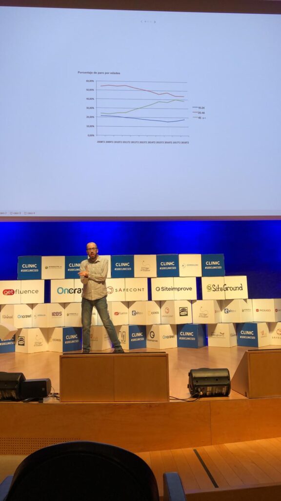
Pere Rovira, founder of OneTandem, opens the second round of the Clinic Summit.
Pere Rovira is working on data visualization for three years, after many years of experience in web analytics and digital marketing. This is what he tells us.
Companies provide us with a data set, which we freely explore with Tableau. From them, we present you with some preliminary conclusions with what you see in your data and navigate to different endpoints to further analyze different topics. Either dashboards are built with Tableau or on custom Web sites with HTML and Javascript.
When it is a private client and the data is for internal use, then Tableau can be used internally.
Here are some examples.
Unemployment analysis
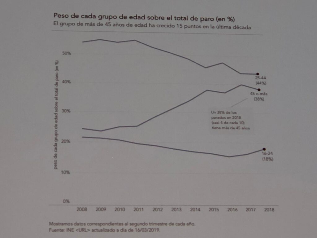
Pere presents the case of a research company working for public agencies. You can live perfectly well without Google Analytics, Pere argues, there are many more people using data. The same techniques or tools we use can be used. In this environment, for example, Excel is used extensively. This is a typical Excel chart.
This customer asks us to learn, to know how to analyze and display the data. This graph presents the percentage of unemployment by age with the typical Excel aesthetics. Conclusion: the older they get, the more unemployed they are.
Second attempt to explain the same data:
We add some interpretation in the accompanying texts. These texts must be taken care of because they allow the reader to better understand the data.
Often, percentages are not the best metric to understand what is happening:
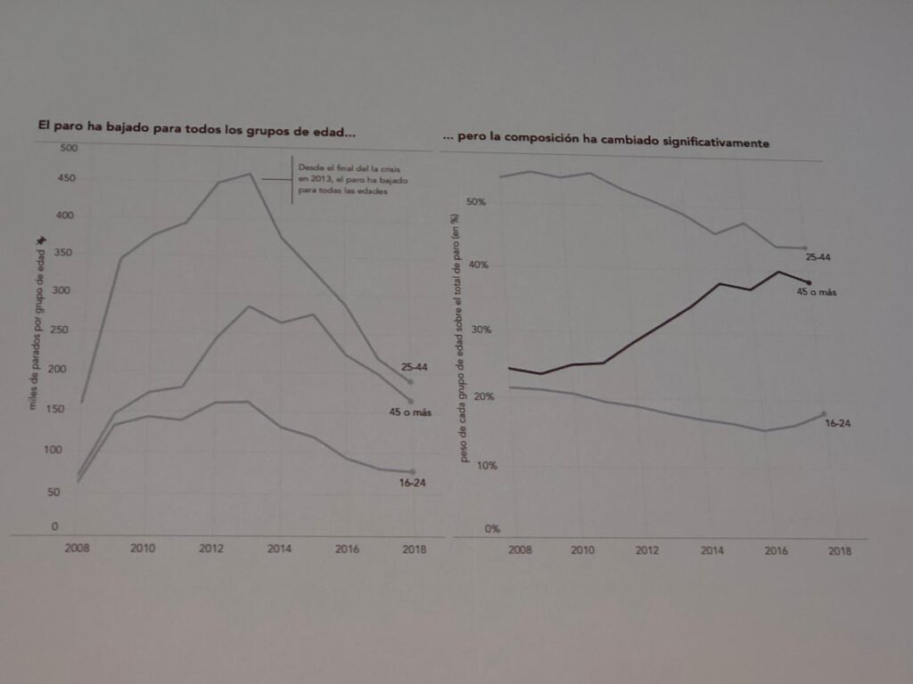
In this chart we are giving another context with metrics that complement each other to build a short story with text and annotations that provide information.
Too much information
Sometimes the problem is to include too much information.
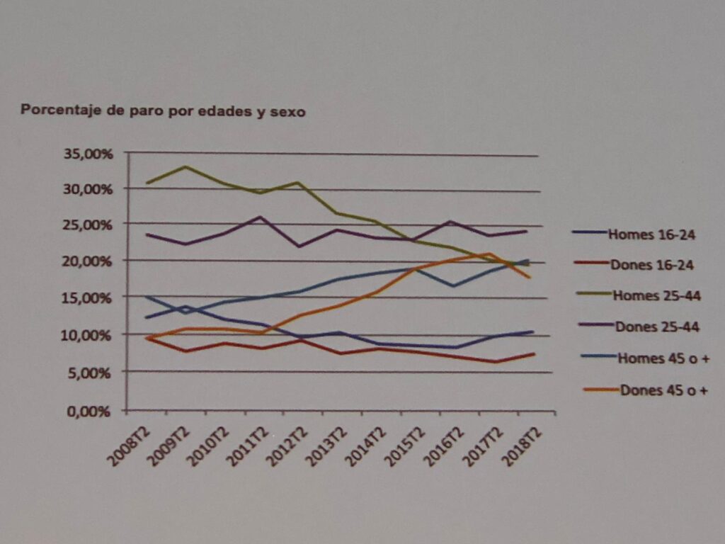
Our brain processes graphs with so much data poorly, with more than five or six data at a time. It is difficult to design this to be better understood if we do not reduce the data.
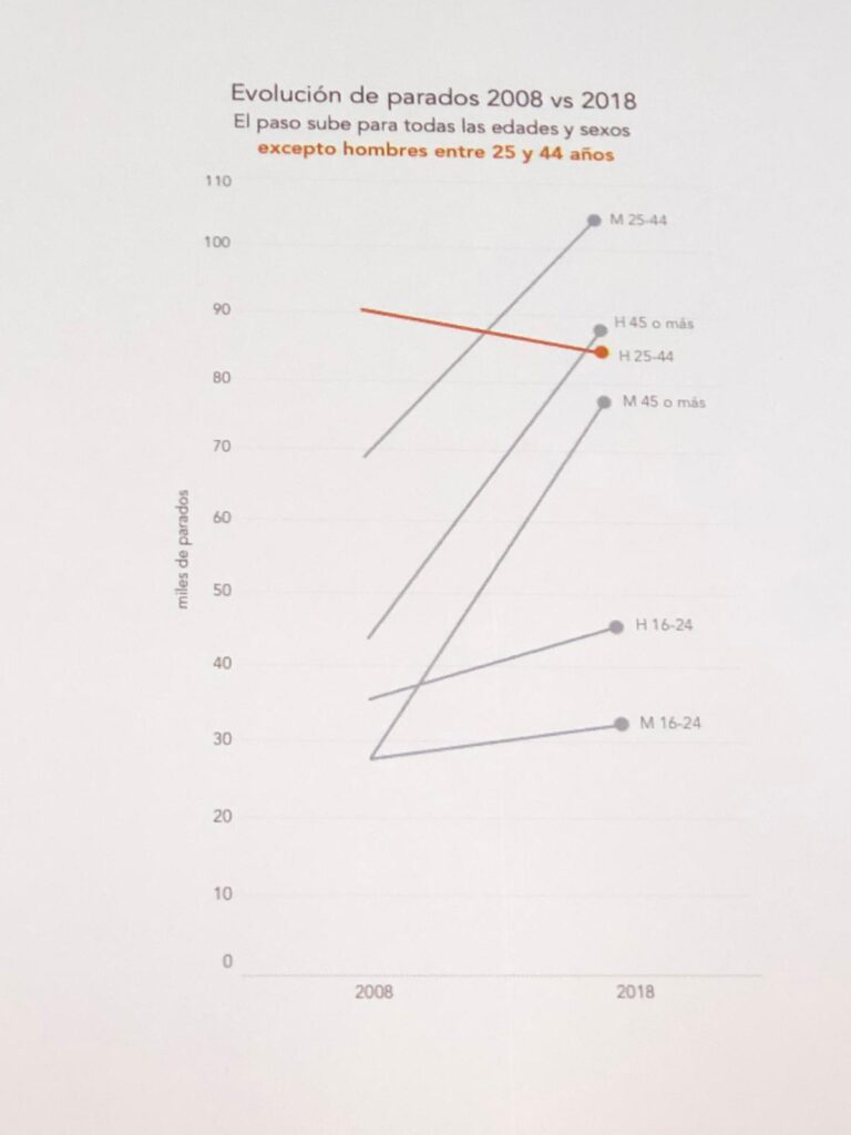
We use color to highlight what we want to emphasize: the only segment for which the data has dropped. We coordinate the same color in the graphics as in the text to make it easier to read.
We can also reduce the number of segments.
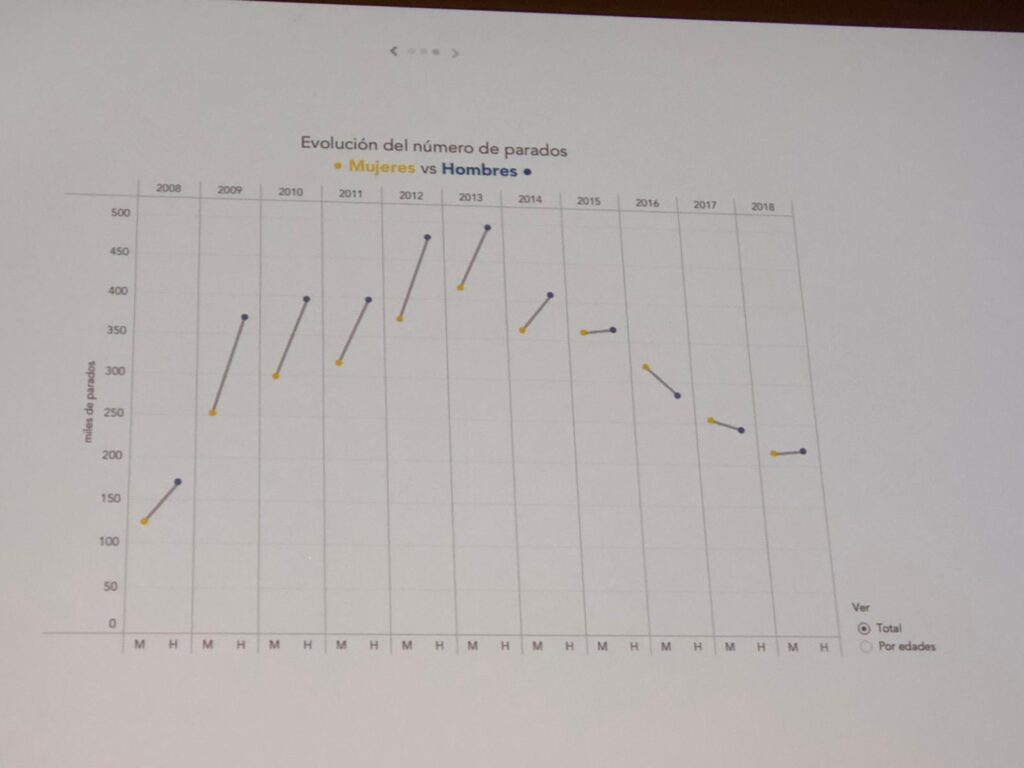
In this chart we can test formats to see what appears. It shows very clearly that the unemployment differential between men and women has been narrowing in recent years.
Correlations
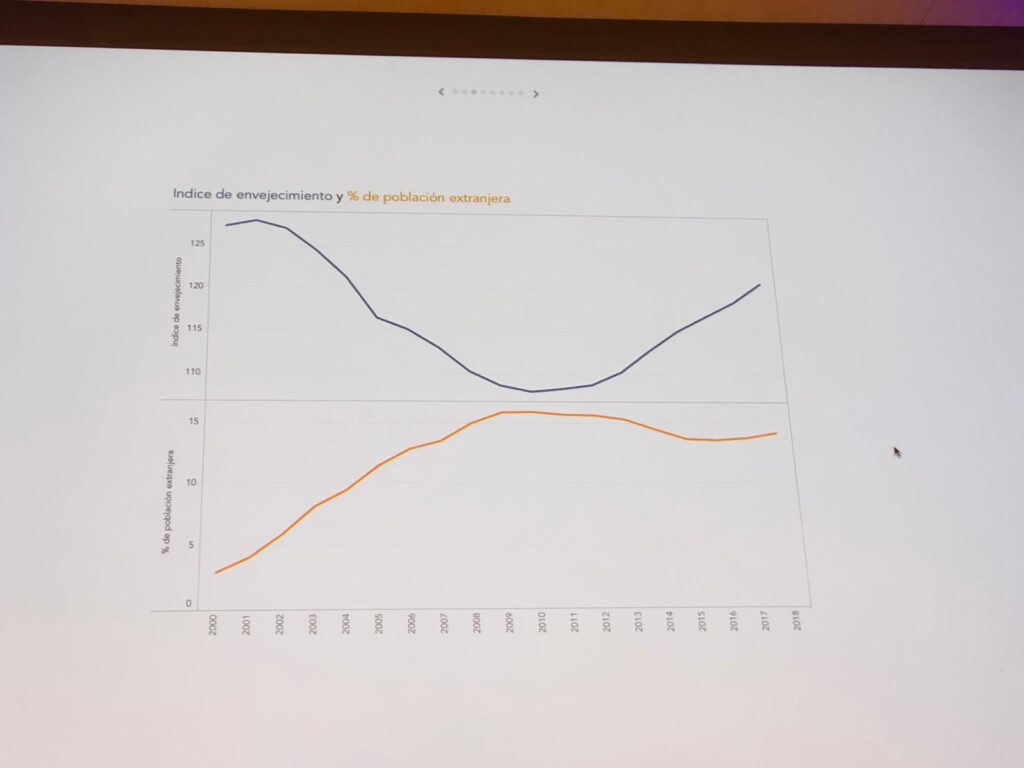
Correlation between aging index and percentage of foreign population:
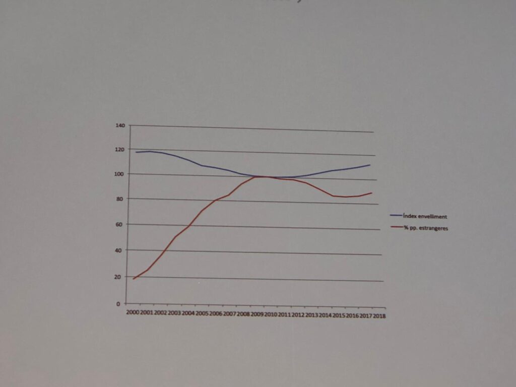
It encourages an interpretation: young foreigners are coming to help prevent the aging rate from increasing.
These are two different metrics on the same graph, with different axes. The axis on the right have forgotten to put them, which gives rise to erroneous interpretations.
We can manipulate:
By applying different scales to each of the axes, the interpretation lends itself to biased interpretation:
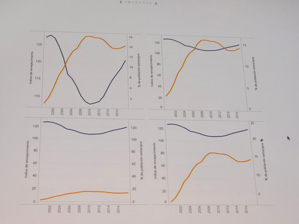
We can provide more context by adding annotations or comparing two metrics by normalizing the data:
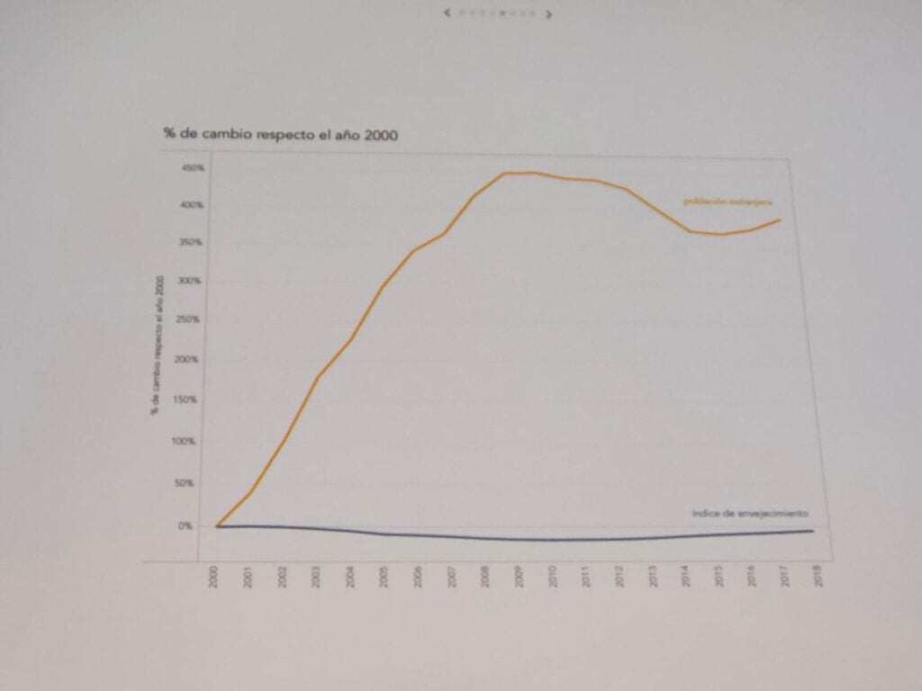
What seemed to be a very clear correlation now presents more doubts. The foreign population is increasing sharply while the aging rate is hardly changing.
Scatter plots can also provide context:
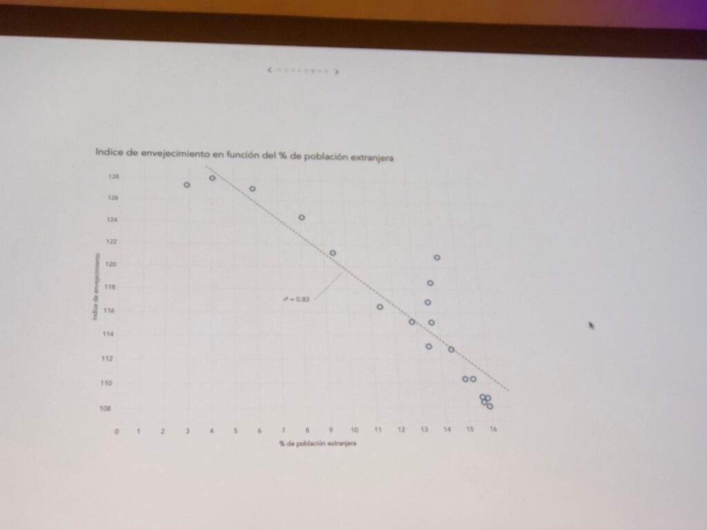
Here we see a high correlation coefficient (0.83) so there does appear to be a correlation but there are three points that diverge from the line in recent years. What does this deviation mean?
If you do not visualize it, you may miss data.
If we join the dots, we can see the history of the data: we see that from 2010 to 2015, the progression is opposite: the number of foreigners decreases and the population ages again. But in the last three years, the trend has changed: the number of foreigners has increased, but so has the aging rate. What is happening? By visualizing the data we can have this conversation to draw conclusions:
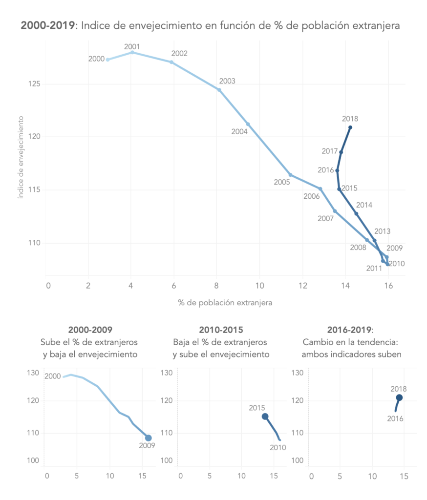
We do not have all the answers. Visualizations that help you think about what the data means.
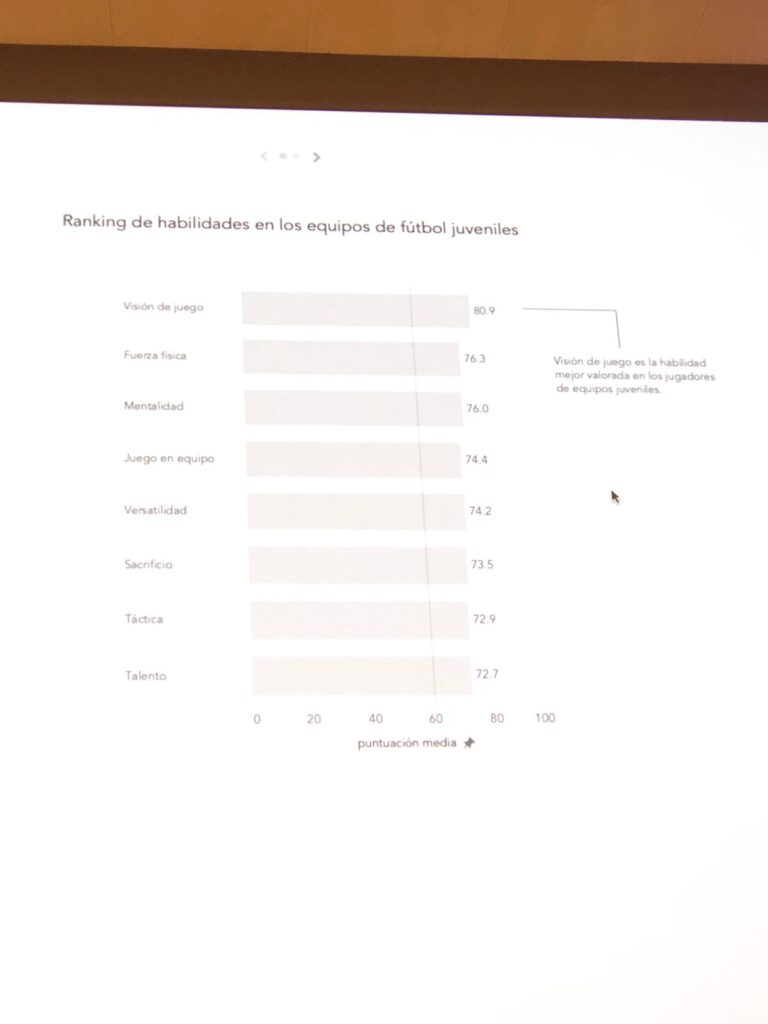
Gaming skills
We try to see playing skills of a set of players with a bar chart:
We can try a different visualization to show each player as a dot:
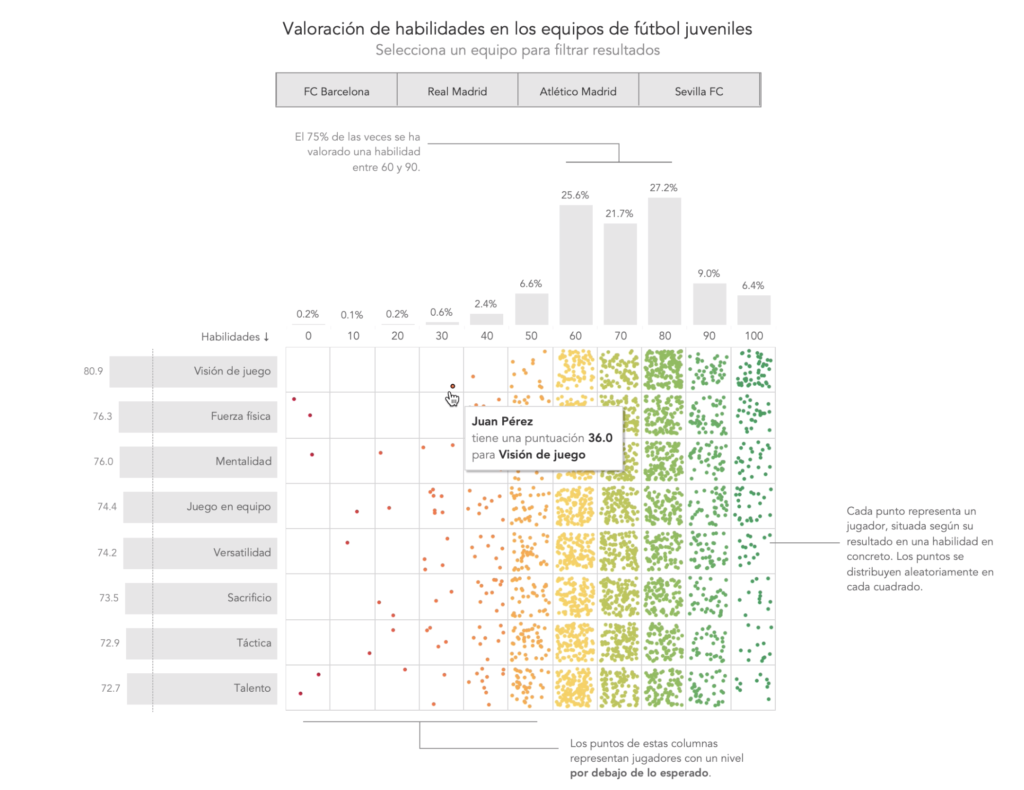
And we see what other gaming skills they may have. We can filter by team, skill, etc.