


Data-driven analysis and decision making
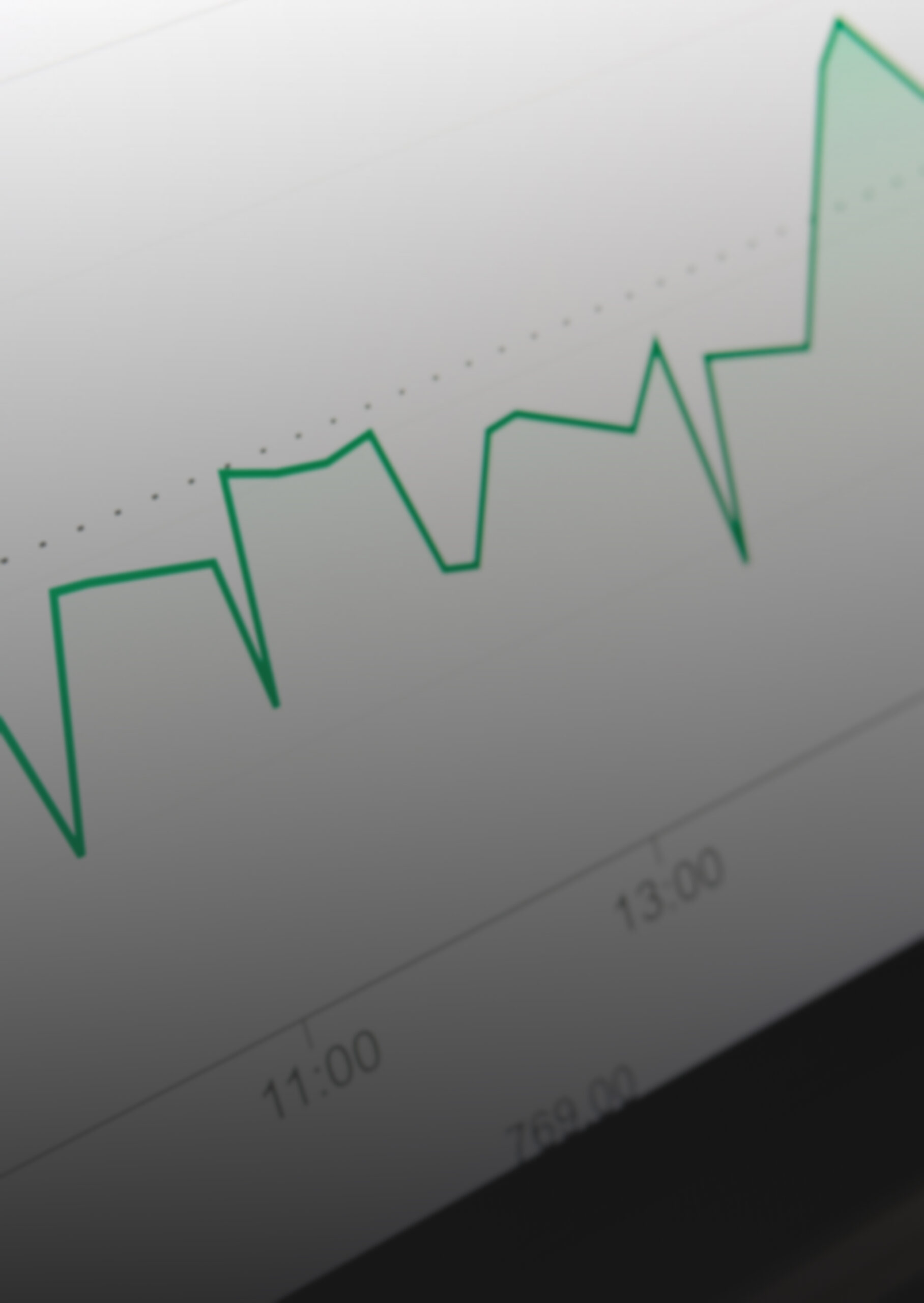
Web analytics is the key you need to measure the effectiveness of your digital strategy and detect improvements. At Human Level, we help you measure and analyze your website’s visibility by gathering and connecting the necessary data to generate valuable insights for your business. Digital analytics is essential for understanding your organic traffic and supporting your SEO efforts.
Why invest in web analytics?
The fundamental pillar for obtaining valuable information about your website
- Measure the effectiveness of your traffic channels
- Assess how visibility affects your business
- Control your main KPI’s
- Identify the most effective channels for conversion
How do we do it?
Implementations adapted to your business
Setting up Google Analytics and Google Tag Manager
We set up key performance indicators to track your visibility and the effectiveness of your SEO efforts.
Analysis of organic traffic beyond search engines
We set up traffic source groupings to identify the main organic channels, both search engines and AI platforms.
Reporting and data visualization
We create dashboards tailored to your key KPIs to simplify site management and data-driven decision-making.
Main digital analytics tools we work with

What tool do we work with?
We use Google’s data visualization tool, Looker Studio, to display the data in the form of dashboards.
What data sources do we work with?
We connect reports with Google tools such as Google Sheets, Google Analytics, Google Search Console, Google Ads, as well as external tools like Semrush and Ahrefs to provide a more complete picture.