

Written by Rocío Rodríguez
Index
- What is a landing page?
- How do landing pages work?
- Elements and aspects to consider when creating landing pages
- Create an eye-catching title
- Displays relevant content
- Describes the benefits of the product/service (Value proposition).
- Uses bullets
- Place the forms on the first screen of the page.
- Includes eye-catching buttons
- Uses calls to action (CTA)
- Beware of elements that distract the user’s attention
- Includes multimedia content
- The importance of testimonials
- Show your awards and certifications
- Includes share buttons
- Don’t forget the privacy policy
- Do A/B testing
- Use metrics that allow you to measure conversions
- Take care of the page design
- Create landing pages adapted to all devices
- Common mistakes that should not be made
- Conversion-oriented landing page example
Users who arrive at landing pages are potential customers with a high probability of generating a conversion.
As the name of these pages indicates, this is the first page the user visits in the entire site, i.e., the page where the user lands. To do so, they had to click on a link from third-party sites: search engines, other websites, Google Ads or display ads, etc. This demonstrates a real interest on the part of the user in the products or services we offer.. It is up to us to show relevant content or not and, in turn, it will depend on whether we manage to increase conversions or, on the contrary, lose them. At the end of the day, the success of our business will be measured in conversions, which is why the design of the page is so significant.
What is a landing page?
These are pages that are created with the purpose that the user performs a certain action on it: register, call, buy a product, hire a service… This action performed by the user on our page is a conversion. For this to happen, there must first be a first contact between the user and the page that generates a relationship of affinity between the two. The page must empathize and satisfy the user, so it is extremely important not to neglect any aspect of its design and its content, because the fact that we get that conversion is a very important factor. is going to depend, to a greater extent, on us. There can be landing pages for Google Ads strategies, e-mailing, social networks…
How do landing pages work?
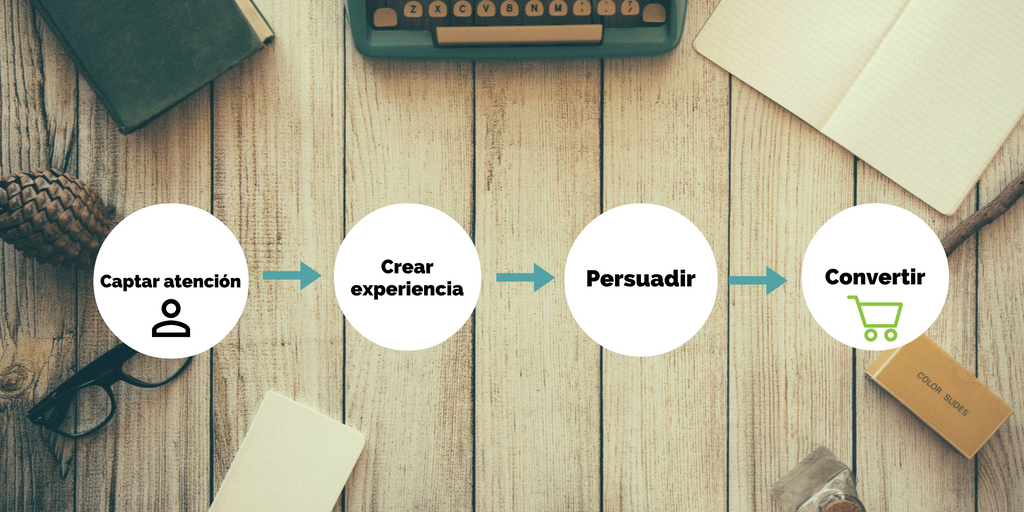
Every landing page must capture the attention, from minute one, of everyone who accesses it. In this way, the user will feel the need to find out more about the product or service we are offering. But to get that lead, it is not enough just to capture their attention, we must also create an optimal user experience that encourages them to stay on the page. It is just at that moment when we will show you the necessary elements that will persuade you, with the sole objective that you end up carrying out the conversion.
Capturing the user’s attention, creating memorable experiences and using persuasion correctly are the three key elements to achieve conversion.
Elements and aspects to consider when creating landing pages
There are a number of aspects that should not be overlooked when creating an efficient, optimal and conversion-oriented landing page. The following are the most relevant points:
Create an eye-catching title
The title is the first element that users will see when accessing the page, so we must not neglect it. This text is key in the phase of attracting the attention of users. An attractive headline will be more likely to convert that visit into a conversion than one that is not. It is important that the title summarizes, briefly and concisely, what we offer and that it is related to the content of the page.
Therefore, the headline should be:
- Easy to understand
- Direct
- Contain the most relevant information
- Brief
- Attractive
- Must be related to the content of the page
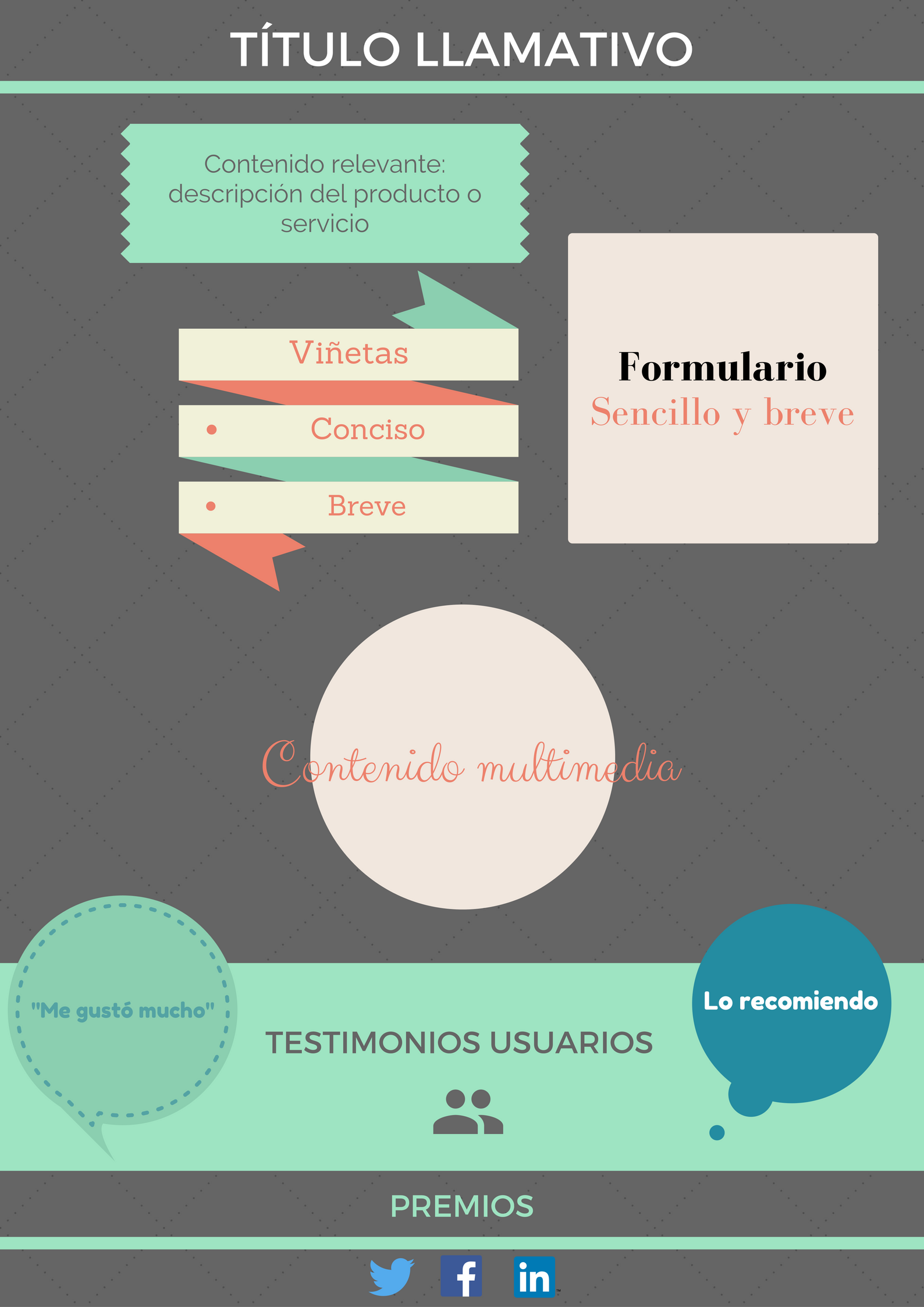
Displays relevant content
When the user accesses the page, he/she must feel that he/she has found relevant content related to what he/she was looking for, that is, that his/her search motivation is satisfied. If we don’t offer you what you expect, you won’t hesitate to leave the site, thus losing a possible conversion.
As a general rule, it is not advisable to use a large amount of text. Users are impatient and look for the immediate, they will make a quick “x-ray” of the page, so the content must contain the necessary elements to retain their attention and get them to perform a certain action.
The way the text is written is also crucial. It is recommended that we speak the language of the users.
Describes the benefits of the product/service (Value proposition).
 Don’t forget to point out the benefits of the product or service you are offering, it will be your value proposition and what will differentiate you from the competition. The user has an infinite number of offers to choose from, so if he/she is not convinced by yours, he/she will leave the page without further ado.
If the benefit that the user obtains is sufficiently attractive to him, he will carry out a certain action on the page that will culminate in the generation of a new conversion.
You can offer access to exclusive content, additional information, free courses… It all depends on your type of business and the product or service you are offering.
Uses bullets
It is advisable to make use of bullets or lists. These will help to summarize, in simple steps, the product or service we offer to the user. It is a way to show you relevant content in a direct, brief and concise way.
Place the forms on the first screen of the page.
The first screenshot of the page, also known as the above the foldis that part of the page that the user can see without scrolling.. It is recommended that the form be included in this place on the page, since it is the first place on the landing page that users will see when they access it.
Users like to have it easy, they don’t have a lot of time to search and decide, so the simpler the process, the better.
Aspects to take into account when creating the form:
- There should be no confusing fields (if there are, we will provide the necessary indications so that the user can successfully complete the process).
- Easy to understand
- With few fields
- Minimum information should be requested
If you want your forms to convert, do not make them endless: users will get tired and will not complete them. It will be enough to include the minimum fields that allow us to collect the necessary information.
An element that cannot be missing in your page are the buttons that attract the user’s attention. Include buttons with bright colors that change color or size when you place the mouse pointer over it. You will capture their attention and you will also be “inviting” them to click.
Uses calls to action (CTA)
Don’t forget about calls to action (CTA). We must take advantage of them to include all the competitive advantages of our business, that is, the benefit that the user will obtain and that will make us stand out from our competition: free registration, discounts, try the free version, call now, ask for a free quote, etc.
Beware of elements that distract the user’s attention
One of the most common mistakes made during the design of these pages is to include elements that divert the user’s attention, such as navigation menus or links to related content. We must dispense with these elements that may mislead them. On the page, we want the focus to be on the content, since this is what will ultimately cause the user to complete the conversion cycle or not.
Includes multimedia content
Undoubtedly, what most attracts the user’s attention are the images and videos. The user does not read, he just glances through the content of the site and it is during this short period of time when we must manage to show him enough stimuli to make him stay on the page. The inclusion of multimedia content on the page can be decisive in whether or not conversion occurs.
Include attractive, appealing and selling images on your landing page. Ditch those images that everyone else can access through the browser and get your own images. Originality will play a point in your favor.
Videos also work very well because they allow you to show, in a few seconds, your value proposition. Make a video attractive to the user’s eyes and show them content of interest. Do not exceed in time and briefly summarize the benefit they will get. Be direct and don’t beat around the bush, the user has no time to waste.
The importance of testimonials
Inclusion The use of testimonials from satisfied users will build confidence in new visitors to the site.. In a situation of doubt and uncertainty in which the user is still unsure whether to perform the requested action, these testimonials can be key to instill confidence and encourage them to finish the process. This section will be very useful, especially in those landing pages that offer paid offers.
Show your awards and certifications
 Awards and certifications will give value and prestige to the products or services you offer. However, it is not correct to indulge in self-promotion. Mention only those rewards that help reinforce the offer you are making.
 It is interesting to include sharing buttons that link to the main social networks so that the content can reach a much wider audience. These buttons should be located at the footer, so as not to create distractions. If a user arrives at our site If you think the content is relevant and you want to share it, you will be able to do so quickly and easily.
Don’t forget the privacy policy
Users are increasingly concerned about the privacy of their data and distrust the use that can be given to their personal information, so it is not superfluous to include this section on the page. The privacy policy must always be associated with the submission of data, so it will be placed below the form and must be clicked to complete the action.
When we include this field we must be very attentive to its design, because we do not want the user to be redirected out of the page when clicking on it. Therefore this information will be included as a popup window or a lightbox.
Do A/B testing
It is of utmost importance to test to see what works best, only in this way we will be able to create a landing page. optimal and efficient. The ideal is to create two types of templates in which we show the content in different ways. Let them run for a while and then measure the results. Which one has generated the highest conversion rate for you? In which of them has there been a higher bounce rate? Which elements have worked best on the two pages? The conclusions obtained will help you to create an optimal landing page that will generate profits.
Use metrics that allow you to measure conversions
It is almost mandatory to use metrics that allow us to analyze the visits and conversions of the page. Measuring conversions  allows us to improve. It is advisable to use web analytics tools such as Google Analytics and connect this, in turn, with the Google tool, Search Console. While Analytics will offer us information about bounce rates, average time spent by the user on the page… Search Console will provide us with data on total number of clicks, CTR, position in the SERP, impressions obtained… By analyzing all these elements we will know which aspects of our site are not working properly.
It is also interesting to analyze heat maps in order to know what behavior the user adopts once he/she accesses our page: areas where he/she clicks, places where he/she moves the mouse… Tools such as Hotjar allow us to carry out this type of analysis. By analyzing user behavior you will obtain data that will help you improve conversions. This article in which we talked about how to improve your business conversions using Hotjar, may be of interest to you.
Take care of the page design
Although it may seem an insignificant aspect, users pay a lot of attention to the design of the page. While a site with a professional design will generate trust, another one with a professional design will that shows a sloppy design will transmit insecurity. If we want users to complete the conversion cycle, it is important to take care in detail of all these small aspects that, although it may not seem so, can cause us to lose many leads.
Create landing pages adapted to all devices
 Today, a large majority of users access the Internet through their cell phones. This percentage of users is growing more and more, so we should not ignore them. If a user arriving at your landing page has to scroll the screen to read the content, they will get tired and leave (unless they are very, very interested in your products or services).
Create landing pages responsive so as not to lose potential users. Not taking mobile devices into account can cause you to lose a lot of conversions.
Common mistakes that should not be made
- Display content that is not relevant or not related to what the user is looking for.
- Create a very long and difficult to understand form.
- Not tracking conversions.
- Include outbound links.
- Do not create landing pages oriented to mobile devices.
Conversion-oriented landing page example
As we have seen, the creation of a landing page is a laborious process in which we must pay attention to many elements that acquire great significance and importance along the way.
I intend this article to serve as an aid for the creation of efficient pages and not to be used as an exact model to follow since, at least for the moment, there is no precise formula for landing page design. Every business is different and not all work the same. However, the aspects and elements mentioned in this post are especially relevant in landing pages, so they must be taken into account when creating conversion-oriented landings.