

Written by Aurora Maciá
Index
Fernando Maciá, CEO of Human Level, attended the Desayunos Invat-tur last September to give a presentation on mobile SEO oriented to tourist portals in the Valencian Community. Invat-tur, “the Valencian tourism agency”, as they define themselves, is a center specialized in tourism knowledge where all the agents of the tourism sector meet.
The purchase decision process
Fernando begins by describing the five phases of the purchase decision process:
- Inspiration. The traveler sees something that connects to a need. Destination websites serve as inspiration and direct users to the booking websites where the conversion takes place.
- Planning. Hotel selection, transportation, visits…
- Hiring. At this point the user arrives at the reservation websites of the mentioned services.
- Sharing the experience. The traveler uploads his photos and relates his experiences while on the road on social networks, serving as inspiration to others.
- Return home. When the traveler returns, he/she values his/her stay at the hotel and recommends his/her experiences.
The role of the Internet in the travel industry
Next, Fernando points out the importance of the Internet when it comes to documenting ourselves before taking a trip: 92% of travelers resort to the Internet to confirm opinions or recommendations they may have obtained through other means (family, friends, TV…).
The CEO also provides a series of other data that position the Internet in general and search engines as the means most used by users to search for information and manage their trips.
The unstoppable growth of mobile access
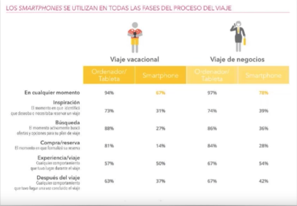 More and more people are replacing the use of desktop computers with mobile devices such as tablets or smartphones. Therefore, we must be well positioned on any device. Smartphones are used in all phases of the travel process, even though in certain phases, such as filling in data to make a reservation, users still prefer the computer. As interfaces improve in this regard and become more compatible with mobile devices, bookings from smartphones or tablets will increase.
Furthermore, the speed of these devices (e.g. 3G) is not comparable to ADSL or fiber optics. This is a factor to take into account in terms of usability when adapting our websites, in fact, Google rewards the fastest websites by positioning them above the slowest ones.
Screen size can also vary drastically between a smartphone and a large desktop computer screen, so our website must be able to adapt to the different formats to make it comfortable to browse from any device. A number of recommendations that Fernando gives us in this regard include the need for font size to be scalable, to consider usability more than ever and to give greater importance to the navigation hierarchy. We must not forget that on a tablet, for example, we do not have a physical keyboard or mouse, so it is best to avoid the user having to type long texts or being unable to navigate using the fingers. Voice terminals could also address data entry limitations.
Another noteworthy factor is that the use of a smartphone or tablet is associated with a single person, so their search history will influence the relevance factor related to personalization of results much more strongly.
How is our mobile traffic performing?
We can go into Google Analytics and segment by device to compare the organic traffic obtained from each terminal. We can also compare the quality of visits at each terminal. If we do not have a conversion target, such as tourist destination websites, our factors to take into account (related to quality) would be dwell time, number of page views per session, repeat visits, etc.
With Google Search Console we can also see for how many searches we have appeared on the results page (and in which position) and how many times people clicked and compare again the impressions obtained on each device. We also have a feature through which we can check the usability of our mobile version as seen by Google.
Methodology
What methodology have we used to perform the analysis?
- Analyze the target websites and try to see what differentiates the desktop version from the mobile version. If the website is not adapted to mobile devices, it would already be bad.
- If you change, we will see what type of adaptation you have chosen: mobile specific / dynamic html / responsive design / apps. Each scenario involves meeting certain requirements given by Google.
- We need to see how these adaptations work and whether they actually meet Google’s guidelines. We will check usability, download speed and how the site is positioned for mobile searches.
Searches analyzed for tourist destinations and tourism brands
Some generic searches have been defined that could be applied to all tourist destinations in the Valencian Community and some more specific ones have been added. The analysis of these searches was carried out from May 1 to 10, 2015 geolocated in the Valencian Community.
Mobile optimization test
Through a tool offered by Google in Google Developers we can see if our website is really adapted to mobility and check if it meets Google’s guidelines for standalone URL / dynamic html / responsive design websites.
To measure the speed we can use PageSpeed Insights, which will also tell us how to improve our website programming to make the download as fast as possible.
For the positioning data collection we will use Advanced Web Ranking, so that we can avoid our own geolocation and configure it to the Valencian Community and in mobility.
Sample
- 28 Alicante destinations
- 16 destinations in Valencia
- 11 destinations in Castellón
- 3 domains of provincial boards of trustees
Results of the study of Mobile SEO in tourist destination Web sites
Mobile-friendly sites for Google
- Alicante: 75%.
- Valencia: 19%.
- Castellón: 45%.
- Marks: 80%
- Total: 55%.
Deployment of mobile version detected
Websites with adaptive design / dynamic html / mobile specific / none have been compared. In general, websites with responsive web design are more popular. Later, dynamic html would be used more than the mobile specific version. There is also a large percentage of non-adapted websites.
Correct mobile implementation
- Alicante: 64% / with minor changes it would be achieved: 11%.
- Valencia: 19%.
- Castellón: 27% / with minor changes: 18%.
- Brands: 60% / with minor changes: 20%.
- Total: 45% / with minor changes: 10%.
Download speed comparison (in mobile)
Websites that did not have mobile adaptation are much slower, as they download the same version that would be offered on a desktop computer (e.g. very high resolution photos that need to be rescaled).
Visibility comparison (mobile)
We have analyzed the whole set of searches and an average has been made around which websites rank better or worse.
Recommendations and best practices for Mobile SEO
- Google Bot Mobile
- Google Recommendations for Web Mobile
- Knowing what part of our audience uses mobile devices, traffic study. What they search for and what devices they use.
- Check Google Search Console for mobile crawl errors. Ask Google to crawl our website as if it were a cell phone.
- Activate the iPhone version of user-agent in User Agent plug in in Firefox to emulate mobile results and see how our website behaves.
- Implement some of the adaptive options:
- Responsive design: unique html source code, URL and content to crawl. Different CSS.
- Dynamic HTML: different HTML content and CSS. Same URL. Include http header “Vary: User-agent” to avoid being detected as cloaking.
- Mobile version (m.domain.com): different HTML, CSS and URL files. The URL of the desktop version is indexed. Include “alternate” and “canonical” HTML headers.
- Compare desktop and mobile results
- Mobile web or app? If we need users to be able to access the content offline, it would be advisable to offer an app. However, in general, a mobile website is usually more useful and they work better and better.
The presentation was followed by a round of questions.