Tabla de contenidos
Usability is the optimal basis or necessary condition on which to build a conversion-oriented website. According to Jakob Nielsen, “Usability is the extent to which a product can be used by specific users to achieve specific objectives with effectiveness, efficiency and satisfaction in a specified context of use“.

It is often much easier to perceive the lack of usability than the satisfaction of a usable design. A website is a user interface where content and functionalities are combined. Visitors to a website come to do something or use it for a purpose, to satisfy a need.
This is not to say that a usable design necessarily has to be ugly. On the contrary, when a design is usable, simple and functional, it will most likely be beautiful. But we must be clear that the overriding principle governing design is usability and not aesthetics.
How to ensure the usability of a website
A new website will be usable or we will be able to improve its usability by following two ways of working:
- Applying certain principles and best practices in website design: one of the best references for these principles is this article where Jakob Nielsen describes the ten general principles for user interface design. It is often referred to as “Jakob Nielsen’s 10 heuristics”.
- Subjecting the design to a battery of tests with representative users who will be asked to carry out the most frequent tasks of the site, analyzing the problems and frictions detected in the daily use of the site and improving it.
Heuristic analysis
Heuristic analysis is performed by an external consultant or by the project manager himself, checking whether the proposed website or prototype adheres to the principles of good practice in user interface design:
- Visibility of system status: the website should always inform the user about what is happening.
- Common language between system and user: the system must speak the user’s language, avoiding incomprehensible technical terms or technical jargon.
- Freedom and control by the user: the user must have control of the system; his or her actions cannot be limited. The user should always be offered a form of “emergency exit” should an unexpected situation arise.
- Consistency and standards: consistency refers to, for example, not using two different literals to refer to the same content, or not using different styles within the same site. In addition, the website should follow widely accepted design standards or conventions.
- Error prevention: better than a good error message is a design that prevents the error from occurring.
- It is better to recognize than to remember: this principle refers to the visibility of the different options, links and objects. The user does not have to remember where certain information was found, or how to get to a certain page.
- Flexibility and efficiency of use: the site should be easy to use for novice users, but also provide shortcuts for advanced users.
- Minimalist design: any type of information that is not relevant to the user and that overloads the interface should be avoided.
- Allow the user to fix the error: for example, when a user enters a query in a search engine and does not get any results, the user should be informed on how to fix the problem with messages such as “enter a synonym” or “you meant to say...”.
- Help and documentation: it is always better if a website can be used without the need for help or documentation, although in extensive websites or in processes such as filling out a form, contextual information and help should be provided to the user.
The heuristic analysis is usually performed by more than one consultant who evaluates each of these points. Subsequently, the final score is the average of the grade given by each consultant. The participation of several consultants is justified by the subjective involvement inherent in the assessment they have to make.

Daniel Torres Burriel, author of the book “Usability – Stop suffering“, published by Anaya Multimedia in 2017, proposes in his blog a practical and very useful template to carry out a heuristic analysis.
Evaluation with users
User testing is a usability test based on the observation and analysis of how a group of real users with a profile similar to that of our potential customers interact with our design.
These sessions focus on the evaluation of the site while performing the most representative tasks of the site (navigation, internal search, purchase, booking, reservation, consultation, subscription, alert registration, etc.). An analyst takes note of difficulties, errors or unexpected results as they arise. Sometimes the time taken to complete a task or the number of errors to complete a task can be measured.
We can perform usability tests during the design phase or with the website already published. In the design phase, testing is performed on paper prototypes or low-fidelity Web prototypes ( wireframes) to detect and correct navigability problems. Browsing sessions are often recorded and user feedback is collected as they complete tasks.
Usability testing with users is complementary to the heuristic evaluation and, since it generally involves a higher cost, it is recommended to carry it out only after having detected and solved all the usability deficiencies that may have been diagnosed from it.
Website usability analysis tools
Eyetracking
Although there are scientific procedures for analyzing user behavior while browsing the website such as the EyeTracking, electroencephalography (EEG), galvanic response or facial analysis, used in neuromarketing, there are also navigation analysis tools with recording of user sessions that are much more accessible.
Hotjar
Hotjar is one of the most widely used and with it we have access to the complete recording of everything a visitor has done on the website, from the time he accessed it until he left it.
Among many other things, Hotjar displays heat maps that represent the areas of the screen where you moved the pointer, when and to what extent you used vertical scrolling to view the rest of a page, how you entered data into forms, what errors you made, and how you interacted with the system. You can check in this post how to use heat maps to analyze and improve the usability and conversion of a website.
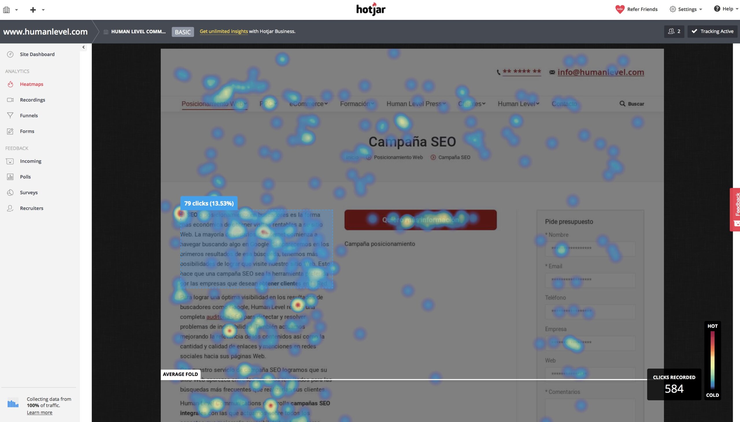
The tool also performs statistical analysis with aggregated data from many sessions to provide representative data on a valid sample of users. Based on this analysis, we can make changes to the layout of the various elements of the site, vary navigation, improve forms or include suggested content to improve the quality of the visit and conversion.
By recording sessions, we can better understand where our users encounter problems when it comes to finding the right menu, filling out a form or using a shopping cart. Although Hotjar is a paid tool, it is also possible to register a free account with limited functionality.
Yandex Metrica
Another very interesting application for analyzing user behavior is Yandex Metrica. Yandex is the big Russian search engine and, like Google, also offers Web analytics functionality.
In addition to basic traffic analytics data, Yandex Metrica includes many of the features found in Hotjar: recording of browsing sessions, heat maps with click-through rates, use ofscroll controls, and form analysis. Here you can learn more about Yandex Metrica and other tools of the Russian search engine.
One of the most interesting features of Yandex Metrica is form analysis. We can analyze each page and the tool informs us of the number of total sessions registered, how many of them interacted with the form and, of these, how many filled in the form and sent the data. This post explains in more depth how to improve the usability of mobile forms.
For business models that monetize through advertising, analytics with Yandex Metrica are also useful when it comes to placing our ads where the most user activity is concentrated, or where they are most likely to click.
In online stores, navigation analysis helps us to discover the optimal placement of buttons to add to the shopping cart, register or go to the checkout page.
Additional usability references
- A basic guide to web usability adapted to SEO
- Nielsen Norman Group Usability Articles
- How to perform a heuristic analysis, Jakob Nielsen.
- Application of eyetracking, Yusef Hassan Montero.
- 10 Nielsen’s heuristic rules and how to apply them, by Cris Busquets