

Written by Fernando Maciá
Index
- The unstoppable growth of mobile access
- What makes web traffic from mobile terminals different?
- How to know if you need a mobile-ready Web site
- How to optimize our website for mobile SEO
- Website with responsive design
- Web site specifically programmed for mobile terminals
- AMP: Accelerated Mobile Pages (April 2017 Update)
- Apps
- What can negatively affect the positioning of your website for mobile?
- Recommendations to optimize your mobile SEO
- References on Mobile SEO
Having a Web site perfectly adapted to its access and positioning from mobile terminals -smartphones and tablets- is increasingly important if we do not want to give up almost a growing percentage of the market.
Web traffic from mobile devices is increasing exponentially.
Web traffic from mobile devices is increasing exponentially. Having a website adapted to these devices is key for both SEO and users.
Web traffic from mobile devices differs from desktop traffic
Web traffic from mobile devices is different from desktop traffic: on the one hand, a mobile device has requirements such as a smaller screen, limited download speed or greater difficulty in entering data. On the other hand, we know where the user is and can thus better adapt the content to their search intent.
Although nowadays no one can argue that having your website mobile-friendly is almost a requirement, you can check in Analytics what proportion of your users browse it from mobile, and in what proportion they convert.
You can adapt your Web site to mobile terminals by implementing responsive design, dynamic HTML or a specific Web version for mobiles, in addition to offering an app to your users.
There are SEO aspects that can hinder a correct indexing and a good positioning of your website in results for mobile searches, so don’t forget to check our list of errors and our recommendations to have your website ready for a mobile world .
The unstoppable growth of mobile access
 Smartphones and tablets are the terminals -generically called mobile-that users are increasingly using to access a Web site. The percentage of traffic that a Web site receives from mobile terminals is currently around 35 to 40% and has only increased in recent years. The consulting firm Gartner predicted in this report on worldwide handset sales that sales of desktops and laptops would decrease in 2013 at a rate of 7.6% while tablet sales would increase by almost 70% over 2012 figures. These figures have recently been qualified by IDC, although the forecast of a 58% increase is still spectacular.
This means that having a website perfectly adapted to its access and positioning from mobile terminals -smartphones and tablets- is increasingly important if we do not want to give up almost 35% of the market. Search engines are no strangers to this trend and Google created at the end of 2011 a new version of its Googlebot-Mobile robot specifically adapted to crawl content for smartphones. The search engine also published this year its recommendations for developing mobile-optimized websites.
What makes web traffic from mobile terminals different?
Requirements inherent to the technical characteristics of mobile terminals and their displays
Mobile-optimized Web sites make it possible to take better advantage of access features from all types of mobile terminals. This access differs in several aspects: the screen formats are different from those of a computer and always much smaller, so that a much more efficient use of the available space has to be made. Bandwidth may also be more limited depending on coverage as well as the ability of the mobile terminal to properly run certain browser extensions.
In addition, it is necessary to minimize the use of the keyboard The user’s input of text from a keyboard on a smartphone is not as comfortable as entering it from the physical keyboard of a computer. For this reason, the interaction elements – forms, buttons, links, etc. – must be sized so that it is easy The following table shows the number of touchscreens that can be used to display the data.
Improved knowledge of the user’s context through geolocation
On the other hand, there is a feature on cell phones that is much more inaccurate on computers: we can access the almost exact geographic location of the user of the mobile terminal, which allows us to adapt the information returned by the search engine and make it more relevant to the specific context of the search. For example, responding to a search for “restaurants near you” would be much more accurate if run from a mobile device than if launched from a desktop computer.
In line with this, optimizing our content for searches of this type can favor traffic coming from mobile terminals, since it is much better adapted to the use and needs of the user on the move.
A mobile terminal is almost always a single user
Thirdly, while a computer can be used by several people , a cell phone is always linked to a single person, so the browsing and search history is much more descriptive of the user’s tastes and preferences. This allows better customization of the results.
This knowledge of the user is not limited, however, to the use he makes of his terminal, but is added to everything the search engine knows he does on the other terminals where he maintains open sessions. Google’s latest algorithm update, Hummingbird, is also much better geared to semantic search by taking into account the context of search at all levels. Given the increasing use of verbal data entry on the phone – speaking into the handset – it is plausible to think that the formulation of searches will change once the added hassle of typing disappears.
How to know if you need a mobile-ready Web site
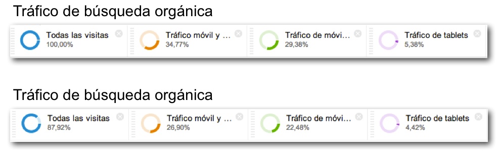
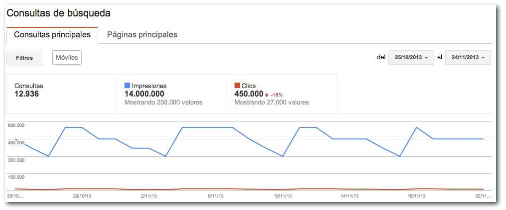
At this point, the obvious answer should be yes. You do need a mobile optimized website. But in case the general statistics don’t convince you, you can always take a look at the traffic statistics of your own website. Compare the composition of overall traffic coming from mobile terminals and organic traffic (coming from SEO) coming from mobile. If the composition is different – lower as in the accompanying example – then it may indicate that your mobile search rankings are not as good.
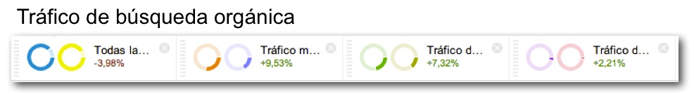
Secondly, we can see how the composition of organic traffic is varying compared to data for the same period of the previous year:
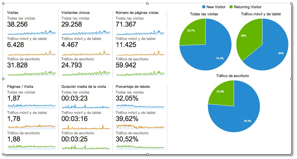
Also check, as far as possible since it is becoming more and more complicated, the searches that generate mobile traffic. Surely the keywords are more related to mobile searches than to desktop searches. It is also interesting to compare the indicators related to traffic quality (average session time, page views, bounce, etc.) of all traffic with respect to mobile traffic.
If mobile traffic deviates a lot from desktop traffic values, we may think that our Web site is not performing as well when accessed from mobile terminals.
We can check its optimization with tools such as Mobile Moxie, the download speed with Mobitest or check how the Web site is viewed from mobile browsers with the user-agents exchanger in this Firefox plug-in.
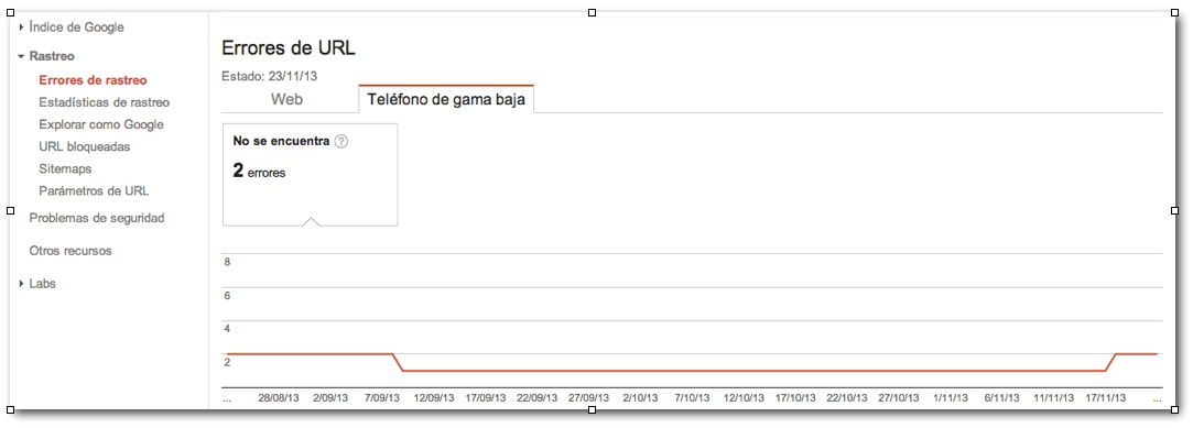
You should also check the indexability of your mobile website from Google Webmaster Tools:
And you can check the queries for which your Web site is ranking when searched from mobile devices at Frequent queries in Google Webmasters Tools:
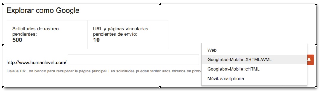
Finally, use the Explore as Googlebot functionality by selecting the mobile option from the drop-down menu:
With all this, we should already have an idea of the current situation of our website from the point of view of mobile access. Based on this diagnosis, we can choose what our Mobile SEO strategy will be.
How to optimize our website for mobile SEO
Basically, there are three ways to develop a site specifically for mobile terminals from a search engine perspective:
- Responsive design websites
- Mobile-specific Web sites
- Apps
Let’s look at each of these strategies in detail.
Website with responsive design
Responsive design websites allow users to view exactly the same content on a mobile device as they would on a desktop computer. Specific styles are used to adapt the layout and design of the Web site to the access terminal, screen format and size, etc.
It is the solution recommended by Google and is usually the best option when what we want is that users have exactly the same content and functionality regardless of the access terminal with which they browse our website.
Web sites with responsive design basically consist of:
- A single source of HTML code: i.e., the content displayed on mobile or desktop access is basically the same, only the presentation changes.
- A single URL: preventing duplicate content problems
- A single piece of content to crawl: this saves search engines resources and avoids duplicate content problems.
- Different CSS style specifications depending on the type of device on which the Web is presented: based on a common HTML code and content, CSS files or cascading style classes are loaded that adapt the presentation according to the terminal, screen format, etc. on which it is displayed.
In this previous post about responsive design, Juan Pedro explains in detail what responsive design is and why it is the preferred option for search engines to optimize websites for mobile devices.
Main advantages of responsive design
- It is the option recommended by Google: the main advantage, not only for Google but for any search engine, is that there is a single URL with the same content for the mobile version and the desktop version, which greatly simplifies the process of indexing and positioning.
- Simplifies content generation and updating workflows, as only a single version of each page needs to be maintained.
Disadvantages of responsive design
- It is more complicated to program and its behavior must be tested from multiple terminals: smartphones of different platforms, screen formats, operating systems, tablets, etc.
- The context of the user browsing from a desktop computer is different from that of a user browsing from a mobile terminal. Sometimes, the type of information required is different, as well as the navigation, which should be easier from a cell phone.
- The weight of the page may be excessive when browsing from a cell phone depending on the network width, coverage, reception conditions, etc. Using the same code for both types of access also increases the total code weight of each page.
Web site specifically programmed for mobile terminals
Although websites with responsive design is the option recommended by Google for reasons of simplicity and convenience for the search engine itself, we must consider scenarios in which we can better respond to our users by designing websites specifically adapted to the specific needs that often arise in mobile browsing.
For example, on a flight booking website, the interface could be minimalistic, allowing the user to identify the origin, destination and desired dates of their flight, check seat availability and purchase seats, change tickets, etc.
In an e-commerce, it is clear that the user’s objective will be to easily consult the price of any product and, if necessary, buy it.
In a news website, the user’s objective will be to consult main headlines, by section or topic, and quickly jump to the development of the content.
And in any local business, the objective would be to inform about opening hours, postal address, contact information such as telephone and email as well as the possibility to make an appointment, make a reservation, etc.
As we can see, there are many scenarios in which a Web site specifically designed for mobile use could be more appropriate than implementing a responsive design solution, with better usability for the user and less weight of code.
From a strictly technical point of view, there are two different strategies for developing Web sites specifically for mobile: either through dynamic HTML or through a stand-alone Web site hosted on a specific subdomain or domain.
Dynamically served pages with user-agent detection through dynamic HTML.
This means that the server detects on each page request whether the browser (user-agent) is from a desktop, tablet or smartphone, selectively loading different HTML and CSS files depending on each.
These Web sites:
- They serve different content but under the same URL.
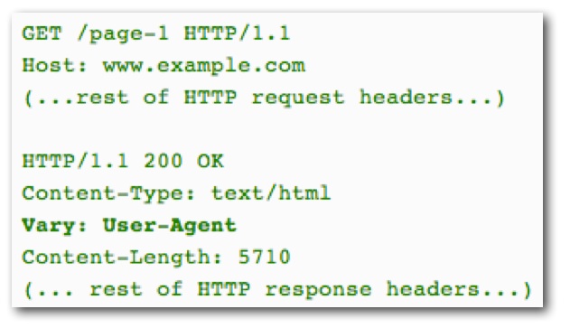
- Since this technique is the one used when cloaking cloaking (a blackhat SEO technique to display different content to users and search engines), it is necessary to include a “Vary: User-Agent” http header that clearly identifies the target of the user-agent detection.
- This option can pose multiple problems when combined with caching schemes. For example, a server could serve incorrect HTML and CSS to a user if it ignores the http Vary:User-agent header or be forced to store multiple versions of the same content due to the multiplicity of browsers (with different user-agents) used by users.
Separate pages for cell phones and computers

These are specific versions of a Web site for mobile access usually served from subdomains such as m.domain.com or similar. These Web sites:
- Use different URLs for mobile and desktop versions.
- Displays two different contents depending on the access terminal.
- Forcing the user to redirect from one version to the other via server redirects or JavaScript
- Since this technique is used when cloaking (a blackhat SEO technique to show different content to users and search engines), it is necessary to include a “Vary: User-Agent” http header that clearly identifies the target of the user-agent detection.
- This option can pose multiple problems when combined with caching schemes. For example, a server could serve incorrect HTML and CSS to a user if it ignores the http Vary:User-agent header or be forced to store multiple versions of the same content due to the multiplicity of browsers (with different user-agents) used by users.
- Google advises using annotations similar to those we use to identify the different international versions of a piece of content to avoid detecting the two versions of the same content – mobile and desktop – as duplicate content.
- In the desktop HTML, we must add rel=”alternate” pointing to the equivalent mobile URL.
- In the mobile HTML, we will add rel=”canonical” pointing to the desktop URL, which will be the one that will actually be indexed.
These annotations can be included in each HTML section or in the sitemap file of the site.
- Specific sitemaps for mobile content can also be used in this type of website.
- The most common is to host this type of web sitesin subdomains such as m.domain.com or domains such as www.dominio.mobi.
Advantages of specific mobile Web sites
- The information can be very well adapted to your consultation from a mobile terminal.
- Mobile users need practical information – opening hours, ticket prices, availability, etc. – rather than descriptive information on a specific topic.
- By creating the Web site specifically for mobile terminals, it can be much better adapted to the use, screen formats, image optimization, to offer a very good user experience.
Disadvantages of mobile Web sites
- The need to use redirects leads to a delay in the user’s access to the appropriate content as well as an extra workload on the server.
- It requires generating and maintaining two different applications -Web and mobile- and to avoid duplicate content problems we must include “alternate” annotations similar to the ones we use for alternative versions of pages in different languages, or generate sitemaps of the mobile content, etc.
- Requires testing the mobile version on multiple devices and platforms for compatibility.
AMP: Accelerated Mobile Pages (April 2017 Update)
An open source initiative promoted by Google together with a large number of media from around the world and other technology partners. It was created with the aim of improving the loading speed of mobile web pages.
How does AMP improve download speed?
Mainly through three avenues:
- AMP HTML: based on web components that manage to lighten the amount of HTML required.
- AMP JS: JavaScript use is restricted to AMP’s own code.
- Use of Google caches: the use of the project’s own CDNs allows this type of server to obtain the AMP pages to serve them to the user in an optimal way.
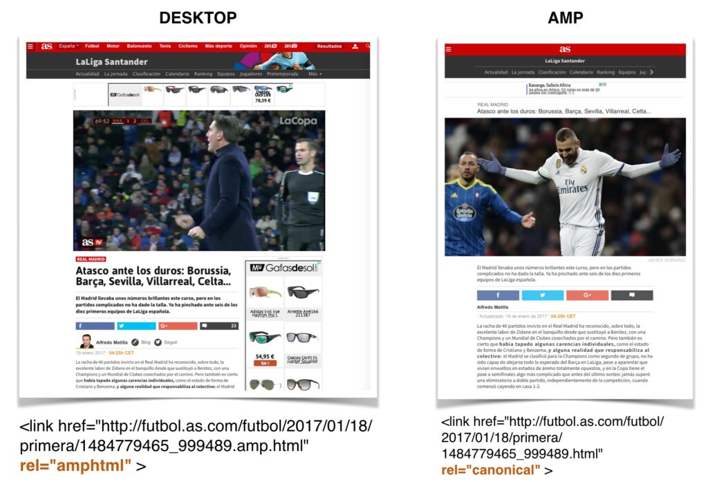
Avoiding duplicate content risk with AMP
The AMP version is still a copy of the canonical content, so to avoid indexing duplicate content it is necessary to include some additional link elements:
- HTML version: canonical to the page itself and amphtml link element referencing the AMP version.
- AMP version: canonical to the HTML version.
Requirements for news to appear as featured in mobile searches
For a page with AMP version to be indexed and positioned correctly, it is necessary to meet these requirements:
- Correct HTML AMP implementation
- Implementation of correct microformats (no errors, warnings are allowed)
Additional references on what AMP is and how to improve the effectiveness of your media ads.
AMP Validation
- Plugin for Chrome: validates AMP implementation https://chrome.google.com/webstore/detail/amp-validator/nmoffdblmcmgeicmolmhobpoocbbmknc
- Web version: validates AMP implementation and structured data https://search.google.com/search-console/amp
Apps
The main advantage of applications is that, if they are well designed and developed, they generate the best possible user experience from mobile terminals. One of its main drawbacks – the inability to be indexed and ranked as a normal website – was overcome in October 2013, when Google announced that it was starting to index apps. Subsequently, it has published specific technical guidelinesfor app developers to take into account for optimal indexability of apps.

In my view, however, it would be desirable for most future online development to go the way of the web mobile rather than the “private gardens” that are apps.
In addition, for an app to be known and downloaded in the first place, it is necessary that it becomes visible to the user and this happens almost always through a Web site that we could call intermediary, which is the one that is positioned in the search engines.
Advantages of apps
- It generates the best user experience for mobile terminals, without any doubt, as long as it is well programmed and designed.
Disadvantages of apps
- It is necessary to program and develop specific applications for at least Android (Google’s operating system for smartphones and tablets) and iOS (operating system for iPhones and iPads) and distribute these applications through the Android Market and the App Store.
- The content was not indexable until very recently and the application is positioned in the respective markets by force of concentrating a large number of downloads in the first moments after its publication.
- To reach the entire market, specific development for Blackberry handsets should also be considered. The behavior must be tested under different devices (iPhone and iPad) and platforms.
What can negatively affect the positioning of your website for mobile?
Google has identified some issues that could be detrimental to your website’s mobile SEO:
- Problems with video playback on mobile terminals: some mobile terminals cannot display certain video formats (e.g. Flash). It is recommended, in any case, to include the text transcript of the video to provide a better experience for all types of users.
- Incorrect redirects: each page should redirect the user to the equivalent URL of the appropriate Web site for their access terminal. That is, if we access the used car section from a mobile device, we should be redirected to the URL of the same section on the specific mobile Web site, and not to the home page.
- 404 errors exclusively in mobile access: if a page does not return a 404 error in its desktop version, neither should the URL to which it redirects when accessed from a cell phone return a 404 error. If there is no equivalent content suitable for displaying to a mobile user, then it is better NOT to redirect that URL and display the desktop version, even if it is not presented quite correctly on a smaller screen.
- Insterstitials to encourage download of the site’s appGoogle discourages the inclusion of interstitials to direct users to download the mobile application and instead recommends including a banner with a link to direct the user to the corresponding app store.
- Incorrect reciprocal links between versionsAs with links pointing to different language versions, links pointing from the desktop version to the mobile version and vice versa should point to the URL of the same equivalent content for the other terminal, and not to the home page of the desktop or mobile Web site.
- Page speed: when accessing from mobile terminals, download speed is a truly critical factor. Google recommends in this article ways to optimize the speed of mobile websites.
Recommendations to optimize your mobile SEO
- Use slightly shorter titles (60 characters) and descriptions (100 characters) for your most visited mobile pages than for the desktop version.
- Focus your mobile content on typical searches for users on the go: restaurant near…, searches such as “activity+location” or analyze which keywords bring you more and better visits from mobile terminals in Google Analytics.
- Offer equivalent links (to the same content) to each of the versions of your Web (if you have a specific one for computers and another for mobile terminals) so that the user can, if desired, consult the alternative version of a page.
- Always include a mobile sitemap file in Google Webmaster Tools with the mobile-specific URLs you want to be indexed.
- Adjust the navigation and the order of the menus in your mobile version to always prioritize the options most requested by mobile users: contact information, opening hours, geographic location and directions, appointment changes, etc.
- In the forms, leave the most frequent options selected by default.
- Identify pages that do not perform well from mobile through Exit Pages, Bounce Rate, low conversion rates or migration of visits to the desktop version in Google Analytics by segmenting for traffic from mobile terminals. Check its usability or make experiments (Google Experiments) with alternative designs.
- Check your website’s mobile download speed with PageSpeed Insights
- Optimize the weight of your images and enable compression on your server.
- Always take into account the most likely context of use of the mobile version of your website and focus part of your content marketing on the creation of specific content for mobile users.
- Make saving to favorites or sending a link by e-mail a very easy option. If users find your content interesting but have difficulty viewing it from a mobile device, it will be the first thing they look for to view it later.
References on Mobile SEO
Finally, some additional references on Mobile SEO.
- Google’s guide to building mobile-friendly websites.
- Technical guidelines for app indexability.
- Posts about Mobile SEO in the Google Webmaster Central Blog.
- Tool to validate mobile Web sites.
- PageSpeed Insights tool.
- Searching the Internet in a mobile world
- Mistakes to avoid in Mobile SEO
- What is AMP: accelerated Mobile Pages?
- Jesús Lizarraga provided interesting tips on how to optimize the mobile marketing strategy at Indusmedia.
- User interaction elements and best practices guide for mobile Web sites.