

Written by Ramón Saquete
Index
- Optimize download and interpretation
- Unify, minimize and compress from a preprocessor
- Browser caching with HTTP protocol cache headers
- Compressing with brotli q11 and gzip
- Delete unused selectors
- Leveraging inheritance and cascading styles to create fewer rules
- Grouping rules
- Using abbreviated declarations
- Use CSS sprites intelligently
- Embedding images with DATA-URIs
- Advance loading of images and fonts from HTML
- Do not use @import
- Use media=”print” for print styles
- Request styles in the header
- Embed the CSS in the page only if it is too little
- Do not enter inline styles
- Organize the CSS well to avoid making more rules than necessary.
- Avoid complex HTML
- Source optimization
- Optimize painting
- Avoid CSS expressions
- Create animations with CSS rather than JavaScript
- Avoid reflow and repainting by specifying the image proportions with an overlay
- If there is an identifier in the selector, there is no need to complicate it unnecessarily.
- Use translateZ to make the browser use GPU graphics acceleration
- Grouping several transformations in a rotation matrix
- Simplifying the complexity of effects that are difficult to represent
- Use CSS before images
- Do not layout with tables
- Layout with grid layout and flexbox
- Avoid extremely complex selectors
- Tools
- Final recommendations
In this guide to CSS optimization (Cascading Stylesheets), we are going to study what is necessary for the downloading and painting of a web page to be done in an optimal way.
In the guide to JavaScript optimization already explained how WPO has grown in importance at the client side.and to achieve more loyal users, allowing us to better mobile positioning.
Recall that in the JavaScript guide, I commented that the optimum, according to the Google’s RAIL performance model es:
- Interface responsein less than 100ms.
- Full draw animationsevery 16ms which is 60 FPS (frames per second).
- Disabled: when the user does not interact with the page, which runs in the background, it should not last more than 50ms.
- Load: the page must load in 1000ms.
CSS affects animations and page loading in the RAIL model. Let’s also remember that, to load the page, the browser follows the critical representation pathHTML download >> DOM construction >> CSS and JS download >> CCSOM construction >> representation tree construction >> layout or reflow >> painting >> composition.
The optimization techniques that we are going to see next will affect all these stages, so if we carry them out correctly, the total loading time can be substantially improved.
Optimize download and interpretation
At this point it is important to understand the cascade of downloads (Network waterfall of developer tools). When a page is downloaded, some files call others and a tree structure of dependencies by levels which would be as follows:
- At the first level we would have the HTML, which is the first thing to be downloaded and would constitute the trunk of the tree.
- At the second level (the branches), we would have the image, CSS and JavaScript resources linked from the HTML.
- In the third level (the sheets), we have the images, fonts and additional CSS linked from the CSS downloaded in the previous step. The JavaScript, once it is running, can also request additional files of any type.
- We could have a fourth level (which could be the nerves of the leaves), since it is possible to have a CSS that downloads another one that in turn downloads another one and so we could have a large number of levels that would make the download totally inefficient.
Now that we know how some files depend on others, let’s see how to create the cascade of downloads:
The browser uses an algorithm called preload scanner to determine that requested files in the HTML block the critical rendering path and thus request these critical resources as soon as possible. It also has a preload scanner for CSS. These algorithms barely understand HTML or CSS, they just look for the linked files to request them as soon as possible.
The critical resources of each level are attempted to be lowered in parallelThis means that these files are requested and downloaded at the same time. But the passage from one level to the next occurs sequentially (files of one level are requested after the previous one), as it is necessary for the preload scanner to analyze the files in order to know which other files to download.
Since sequential file requests are much slower than launching requests in parallel (it is quicker to ask for the information as soon as possible), most of the techniques I describe below are aimed at avoid new levels of the dependency tree (avoid sequential requests), or at least that there are as few critical files as possible at higher levels, since these will be the last files to be downloaded.
Regarding the download, I believe it is necessary to explain that in HTTP1.1, parallel downloading is possible up to a certain number of files depending on the browser.while with HTTP2 there is no limit to the number of files downloaded in parallelThe fact is that, internally, it is actually a multiplexed sequential download on the same data streamIn other words, with HTTP2 it is as if we were downloading a single larger file that will occupy the same network resources as several files in parallel, but with less information and without the cost of sending the requests separately and sequentially in blocks.
Below is a visual example of how the discharge cascade occurs:
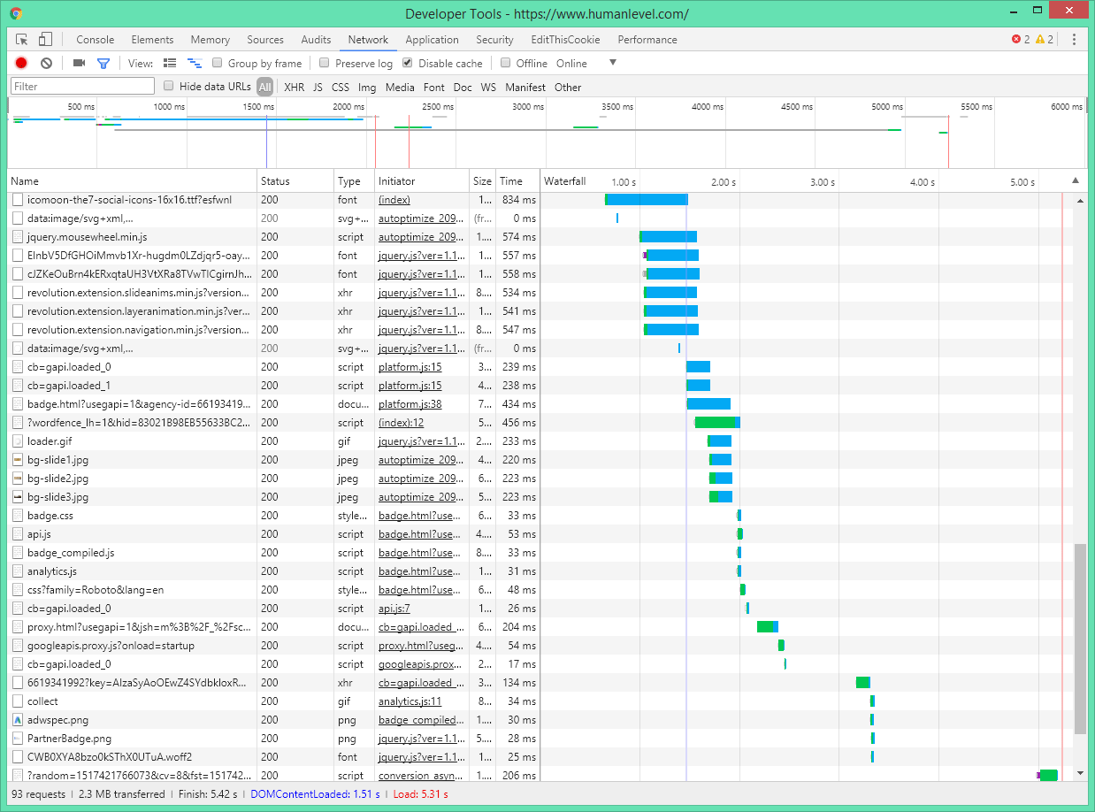
In short, for a quick download we want dependency trees to have as few resource-critical branches and leaves as possible (which are not necessary to paint the page initially).
Unify, minimize and compress from a preprocessor
It is always advisable not to use CSS directly, but to use a language on top like Sass, Less or Stylus. These languages allow you to make the code cleaner and more maintainableThey have a syntax that allows you to write less, define variables, reuse code, separate code into files and, in the case of Sass, use programming control structures.
A file written in any of these languages must be passed through a preprocessor that generates the unified and minimized CSS with its associated source map. These are .map files that will serve us to analyze the CSS in Chrome as if we were working with the original files. This work can be done before uploading the file to the web site with a tool such as webpack, gulp, grunt, etc. or, directly, with the tools of the languages themselves. There are also libraries to do it from the web programming itself, but this option is not recommended because it is a costly process. But, if done, always cache the result so as not to generate the CSS with each visit.
global for the entire website and one specific to the page.. That way we don’t make the user download styles that are not necessary for the page they are viewing.
Browser caching with HTTP protocol cache headers
We will use the header Cache-control with public and max-age values, with a large cache time, of at least 1 year. When we want to invalidate the cache we will change the file name. This renaming can be done automatically by the framework used for development and the tool for transpiling or preprocessing the CSS.
Compressing with brotli q11 and gzip
For CSS files we can follow the same recommendations that I gave in the article on JavaScript optimization and in that of gzip compression.
Delete unused selectors
CSS works with selectors which are patterns consisting mainly of elements, classes, identifiers, pseudo-classes, and pseudo-elements which are used to select those parts of the DOM of the page to which we want to style using properties as “color”, to which we can assign different values. For example:
We do have a simple rule as follows:
#pagina .producto a{  /* <- selector{ */
     color:blue;      /* <- declaración formada por: propiedad:valor; */
}
We are saying that on a page with a structure like the following, the links will be blue:
<main id="pagina">
   <article class="producto">
       <a href="/url.html">nombre del producto</a>
   </article>
</main>
If we do not have any structure on the page with which the rule fits, this code will not be necessary.. With the tool UnCSSWe can include this technique in the CSS generation process from Sass if we use gulp, grunt or broccoli.
Leveraging inheritance and cascading styles to create fewer rules
Some properties such as color, line-height, text-indent, text-transform, font and their variants, … when applied to an HTML element, all the elements contained in it inherit the value of this property. So, for example, we can create the following rule:
body{
font-family:sans-serif;
}
In this way, we are setting the font type for the whole documentThe font type does not need to be specified for each element individually.
CSS is an acronym for cascading style sheets and cascaded means that styles are applied in an order in which the highest priority rules overwrite others. How can we use this to write less? For example, in a blog like this one, we can have rules to style all the entries in a listing, but then we can overwrite some properties of it to style the featured entries, without having to duplicate part of the one we have already created. To know how to do this, the developer must know CSS selector specificity rules since, apart from the location of the styles and the order of the rules, this is what determines which rules have priority over others. For example, suppose we have a CSS with the following rules in this order:
/* Regla 1 */
.clase2 div.clase1 div {
  color:green;
}

/* Regla 2 */
div {
  color:blue!important;
}

/* Regla 3 */
div.clase1 div:first-child {
  color:yellow;
}

/* Regla 4 */
#id1 .clase1 div {
  color:red;
}
And this would be the HTML fragment we want to style:
<div id="id1" class="clase2">
    <div class="clase1">
        <div>Hola</div>
    </div>
</div>
All of the above rules affect the color of the word “Hello”, a developer who knows the rules of selector specificity should see without thinking that the rules apply in the following orderfrom the highest to the lowest priority: Rule 2, Rule 4, Rule 1, Rule 3. Therefore, in this case the word “Hello”, will be shown in blue color by rule 2, although this has been done using the “important” directive, something that a good developer would not do except in certain cases.
Grouping rules
If you have to give the same style with several different selectors, groups selectors by separating them by commas. Example:
Instead of writing:
.clase1{
    color:red;
}

.clase2{
    color:red;
}

.clase3{
   color:red;
}
This can be written in a more abbreviated form as:
.clase1,.clase2,.clase3{
    color:red;
}
Using abbreviated declarations
We can abbreviate several statements, as in the following example:
padding-top: 5px;
padding-right: 5px;
padding-bottom: 5px;
padding-left: 5px;
The corresponding abbreviated statement should be used for this purpose:
padding: 5px;
This way we write less and the CSS will have less code to download.
Use CSS sprites intelligently
The term sprite in computer science arises initially from the world of video games to refer to squares containing images and characters (characters as sprites, which is the literal translation of sprite). In CSS the term sprite refers to rectangles of images to be displayed on the website and that are grouped in a larger image. By merging several images into one, we avoid having to download several files. and so we do not limit the parallel download capacity of the browser if we use HTTP1.1. With HTTP2 this technique does not provide any improvement.
Procure to put together the images that, because of their characteristics, are best suited to the compression of a type of image format. That way we can have some sprites in JPG, others in PNG-8, others in PNG-24, etc.
Using this technique correctly is not about loading 300 icons into an image and then only using one. This is very common and is not the right way, because we are loading and processing a large image and then displaying only a small part of it.
Embedding images with DATA-URIs
The data URI scheme o DATA-URI, allows us to embed images with encoded text strings within CSS. This causes the images to occupy more space. The file in binary format occupies less space than a text file. Let’s take a quick example, if in a file we have the binary value 1111 1111 which in decimal is the number 255, in the text we will have to have the characters 2 – 5 – 5 which in binary are encoded in ASCII with all these zeros and ones: 0011 0010 – 0011 0101 – 0011 0101.
These are more zeros and ones than we originally had, so the file will take up more space. This increase of space is almost completely eliminated if we are compressing the CSS with brotli or gzip, so it is not a problem. In spite of that, this is a very good optimization technique, because we will be gaining a lot in loading time, by avoiding going down one more level in the tree to download the images.
If we use this technique it is not necessary to use CSS sprites, but if we like to organize the images in sprites, we can combine the two techniques.
It should be noted that if the same image is used in several parts of the CSS, we will have to rearrange the layout so that it appears only onceby assigning the same class to the elements in the HTML that will display the image. If we do not do so, we will be downloading the same image several times.
It is also necessary to pay attention to images that are not used or are only used in one part of the site because, contrary to what normally happens with linked images, we will always download those images, whether we use them or not. So this technique should be applied only to images that are critical resources. If you have not followed the recommendation to have two CSS for each page (one with the global styles and one for the current page), be careful with this.
The images that we embed are best placed at the end of the CSS and should not be too largeCSS is a critical resource that blocks page rendering and cannot take too long to download.
Finally, we can use this technique to embed images directly into HTML inside the “src” attribute of the “img” element, but in this case I do not recommend using this technique with large images, because if in the HTML we have many bytes that do not belong to the content we can have indexing problems. It should also be noted that when the image is repeated on several sites or pages, it is better not to embed it in the HTML so that it can be cached and not downloaded several times.
Advance loading of images and fonts from HTML
This technique is preferable to using DATA-URIs.because images can be cached in the browser independently of the CSS and without increasing its size. We can apply it by adding tags like this to the header:
<link rel="preload" href="bg-image-narrow.png" as="image" media="(max-width: 600px)" />
If we advance the request for linked images from the CSS, no need to wait for the CSS to be downloaded and have it analyzed by the preload scanner. This should be applied only to critical resources. We do not want to preload unnecessary resources.
With this tag we can indicate which file we are going to preload and what type it is, we can even specify a media query to load only with certain screen sizes.
Not to be confused with rel=”prefetch” which is to preload resources for the next page to be displayed.
Do not use @import
The CSS import rule (not to be confused with the import of Sass or Less), allows you to import CSS files from within other CSS files. If you have been paying attention you will already know that this is a very bad thing for performance, because we are increasing the levels of the dependency tree, causing one CSS to download another which in turn can download yet another one or download images.
Use media=”print” for print styles
In a style sheet we can set how the web will be printed when sent to the printer. This can be done within the global CSS with a media query or output it in a separate stylesheetin this way:
<head>
   ...
   <link rel="stylesheet" type="text/css" href="/css/main.css">
   <link rel="stylesheet" type="text/css" href="/css/print.css" media="print">
   ...
</head>
In the code above the main.css file blocks the rendering of the page, so it is sent to download immediately by the preload scanner. However, the print.css file does not block it and is downloaded with low priority. So in this way we do not block the painting with the download of the printing styles.
We can use this technique also with the media queries that are used to make the web responsive, but if that will negatively affect the way we organize our code, I do not recommend it.
Request styles in the header
The style sheets should be requested with link elements from the header, because apart from being their correct location, are critical resources that must be downloaded as soon as possible to paint the page.
Embed the CSS in the page only if it is too little
In the pages made with AMP CSS code must be embedded in the page and limited to a maximum of 50,000 bytes. This technique, which also can be applied to non-AMP pages and it is done as follows:
<style> /* <style amp-custom> si es AMP */
/* código CSS */
body{
    background:#0AF;
}
</style>
In the example I have put comments, but the code must be embedded fully minimized and without comments.
This technique means that we do not have to ask for the CSS file (avoids going down to the second level in the dependency tree), but if the CSS file is too large, Google will not be able to index the bytes of the page content so we should only do this with small files. Ideally, this should be implemented in a way that does not hinder the normal workflow and that we do not repeat the same code across multiple pages, so we can use this technique to load the CSS that is specific to the page we are visiting and load the global CSS with the link tag.
Do not enter inline styles
If we use the style attribute on each element of the page to style it, we will be mixing the style with the content and duplicating the styles we use across multiple pages and elements. For this reason using this attribute is considered to be an anti-pattern of performance and maintainability.
If it is a case where we know the style will not be repeated, we can make an exception to this rule. For example, we have to put a decorative background image that is only used in one place and we do it like this:
This will make the image downloadable before we have to ask for the CSS and we will not be repeating code. Although if you don’t want to mix style and content, you can leave it cleaner by taking the style to the header inside a tag
Organize the CSS well to avoid making more rules than necessary.
There are many ways to organize the CSS code clean and elegant. There are many methodologies: ITCSS, BEM, SMACSS, SMACSS, OOCSS, SUITCSS, Atomic… but regardless of which one is used, the important thing is that if the code is well structured, it will be less repetitive and this will have an impact not only on maintainability but also on performance..
If when it comes down to it, there is a case where the CSS code does not fit any of the recommendations of the method used, I recommend inventing new rules of your own so that the organization is not lost.
Avoid complex HTML
No need to assign styles by creating new HTML elements instead of identifiers and classes, nor create HTML elements that are not necessary neither to give style, nor to provide semantic information.
This is because if we have fewer DOM nodes, the DOM will load sooner, take up less memory and, consequently, the CSSOM will be less complex. In addition, by using identifiers and classes, we will have more efficient CSS selectors.
Source optimization
The sources are a critical resource that blocks the painting of texts on the page.. While downloading the font, some browsers will display the page with a system font and others will display it without text. At the end of the download, the user sees the font change or appear, which does not create a good impression.
This is a topic that requires a separate entry, but in broad strokes I will say that do not load more sources than necessaryWhether they are variants of the same font (different thicknesses of bold, italic, bold and italic, …) or character sets that we are not going to use in the language of the current page. Use Gzip or Brotli compression only with older EOT and TTF formats. (not with WOFF or WOFF2 because they are already compressed) and if you want to control how the source is loaded, use the Font Loading JavaScript API.
We can also preload them from the HTML like this:
<link rel="preload" href="fonts/cicle_fina-webfont.woff" as="font" type="font/woff" crossorigin="anonymous">
This article provides more information on how to optimize the fonts of a Web site.
Optimize painting
Avoid CSS expressions
CSS expressions allow you to calculate property values using JavaScript. This, in addition to violating the separation of behavior and style, is very inefficient for the browser. So it is better to replace these expressions with JavaScript.
Create animations with CSS rather than JavaScript
With CSS animations you can make animations by creating interpolations between property values over a series of keyframesas was done with Flash. For those who do not know what I mean, interpolating is the mathematical operation of calculating the intermediate values between several given values. In this case it allows to calculate the values of the CSS properties along the key points set so that the browser can perform the animation. Ideally, you should use only the transform which allows us to rotate, move, enlarge or stretch any layer and the property opacityto make transparencies.
In addition to using only the properties transform y opacityI recommend to do it with layers that have fixed or absolute position (to avoid that the animation displaces the rest of the layers), because in this way the navigator is prevented from launching reflow and paintingand you only need to run the composition of the layers.
Example:
<style>
#animated_div_wrap{
    position: relative;
    height: 70px;
}

#animated_div {
    position: absolute;
    width: 70px;
    height: 47px;
    box-sizing: border-box;
    background: #ba1c1e;
    color: #ffffff;
    font-weight: bold;
    font-size: 20px;
    padding: 10px;
    animation: animated_div 5s infinite;
    border-radius: 5px;
}

@keyframes animated_div
{
    0% {
        transform: rotate(0deg);
    }
    25% {
        transform: rotate(-5deg);
    }
    50% {
        transform: translateX(320px) rotate(-20deg);
    }
    100% {
        transform: translateX(0px) rotate(-360deg);
    }
}
</style>

<div id="animated_div_wrap">
       <div id="animated_div">WPO</div>
</div>
Result:
Make the same animation with JavaScript would be much less efficient because it would be executed in the JavaScript thread along with many other things and browser is optimized to run CSS animations smoothly, prioritizing speed over smoothness. The latter means that if an animation consists of shifting a layer 1000 pixels to the right in one second, in which we have to display 60 frames, the layer will be shifted by 16 pixels in each frame. But if the browser only has time to paint half of the frames, the layer will move 32 pixels at each repaint.
Avoid reflow and repainting by specifying the image proportions with an overlay
When a page is painted, some images may load at the endmaking it necessary to displace everything underneath of these when they have already been loaded. To avoid these jumps, each image must be contained in a layer that occupies the same height that the image will occupy when it is finished loading. This must be implemented taking into account that the image will have different sizes depending on the device and is done as indicated below:
First, the ratio of image height to width is calculated:
Ratio height = height/width * 100
This gives us a percentage that we will set to the “padding-top” property of a layer before the image, that way this layer will occupy the height of the image independently of the width modification. The image will have absolute position relative to a containing layer so that it is mounted on top of the layer that sets the height. Let’s look at an example:
<style>
#wrap-img-ej{
   position:relative;
   max-width:800px;
}

#wrap-img-e div{
   padding-top:56.25%;
}

#wrap-img-e img{
   position:absolute;
   top:0;
}
<style>
<div id="wrap-img-ej">
   <div></div>
   <img src="/img/imagen.jpg" alt="texto SEO" />
</div>
This technique should also be applied to sliders and carousels, where it is frequent that when JavaScript is executed, it causes a jump in the initial load.
To make the use of this technique more agile, we can create a template of the example code above with a web component or directly use the web component amp-img from the AMP component library. The equivalent code to the previous example with the AMP component would be as follows:
<amp-img alt="texto SEO" src="/img/imagen.jpg" width="800" height="450" layout="responsive"></amp-img>
If there is an identifier in the selector, there is no need to complicate it unnecessarily.
Let’s say we have a rule with a selector like the following:
div .clase1 #mi-id.clase2{
    background:red;
}
With this HTML:
<div>
    <div class="clase1">
        <div id="mi-id" class="clase2">
            <div class="clase3">WPO</div>
            <div>CSS</div>
        </div>
    </div>
</div>
This selector doesn’t make much sense because in reality there can only be one “my-id” identifier on the page, so the following selector will work exactly the same and has less code, so it takes less time to load and run:
#mi-id{
    background:red;
}
By this I do not mean that when there is an identifier in the rule, all other identifiers must be systematically removed. The following selector does make sense:
#mi-id .clase3{
    background:blue;
}
Use translateZ to make the browser use GPU graphics acceleration
On layers with animations or simply with transparency (opacity property), use will-change:transform; or translateZ(0), to promote the layer to the GPU hardware where it will be painted faster. But avoid overusing these rules promotion to the GPU, as the layers require memory and management by the browser.
will-change: transform;
transform: translateZ(0);
The two properties will have the same effect, but “translateZ(0);”, with which we say to make a shift in the Z axis to the initial position, works in all browsers, while will-change, is the correct way to implement it because it does not modify layer properties.
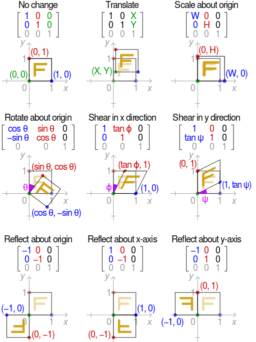
Grouping several transformations in a rotation matrix
The transformations of a vector object are implemented by multiplying the vector of each vertex of the object by a matrix that gives the final position of each vertex. This matrix defines the type of transformation we are going to apply (position, scale, rotation, …). This is what happens internally in the browser when we apply a two-dimensional or three-dimensional transformation to a CSS layer with the transform property.
If we multiply all the matrices that generate the transformations we are going to do, either position, scale, rotation or deformation, we can apply them all at the same time in one step with the resulting matrixwriting much less code and in a computationally more optimal way, since we will use the matrix function like this: transform:matrix(a11, a21, a12, a22, a13, a14) instead of something like transform:transform(x,y) skew(x,y) rotate(x,y) scale(x,y). If it is a 3D transformation we will use matrix3D instead of matrix. In addition, this function allows us to make the mirror effect transformation that cannot be done in any other way:
For the quick calculation of the transformation matrix (it is not easy to do it upside down), it will be necessary to use some Sass library, program or function to calculate it quickly, always keeping in mind that transformations, like matrix multiplication, are not commutative (translate and rotate is not the same as rotate and translate).
Simplifying the complexity of effects that are difficult to represent
The filter property is computationally expensive to apply when used for blurring, contrast changes, brightness changes, etc. However, it can be a good ally to avoid loading more images, if we want to apply some of these effects when passing the mouse over one of them.
Other costly painting effects, are shadows and gradients. If you have these effects and find that the final painting stage of the page takes too long, try removing them.
Use CSS before images
In general, it will always be faster to paint something with CSS than to use an equivalent image, since the image has a download, reading, decompression and painting time that usually exceeds the download and painting time of CSS. Therefore, if you cannot simplify the design, as indicated in the previous point, you should not replace, for example, a text shadow with CSS by its equivalent image.
Do not layout with tables
This seems like a recommendation from the prehistory of the web, but it is still true and even more so if we want a good performance.
Tables are inefficient because a change in the size of a cell affects the position of all elements below it and, if it changes in width, may also affect cells above it.
Layout with grid layout and flexbox
Use Grid Layout and/or flexbox is more optimal and flexible than layout with floating layers and, of course, than with tables. Here we can make use of a framework such as Bootstrap, which in version 4 already uses flexboxes.
With this new way of layout you have the advantage of being able to visually change the location of any element, regardless of the order in which it is being painted in the HTML, with greater freedom than with floating layers. This allows us to have a totally different layout on mobile and desktop and, to leave above the HTML, the first thing we want to be indexed for SEO purposes..
Avoid extremely complex selectors
Normally, in automatic tools it is suggested to avoid complex selectors but I do not recommend paying much attention to this rule because code maintainability is always more important than performance. So my recommendation is avoid only extremely complex selectorsIt is very rare that something as inefficient as this has to be done:
div p a *{}To know when a selector is complex or inefficient we must take into account that the most general parts of the selector (the elements) are less efficient than more specific ones (identifiers). We must also understand that selectors are interpreted from right to leftso have the more general parts of the selector further to the right makes the rule more inefficient, because this causes the browser to have to examine more parts of the DOM to know if it has to apply the rule. In the example above the * operator selects all the elements on the page, then looks to see if all the predecessors of all the elements on the page have a link, then looks to see if all those links have a predecessor p element, and so on, unless at some point no element is found, in which case the selector check stops.
CSS3 pseudo-elements and pseudo-classes are also slow (:first-child, :nth-child(), ::firts-line, ::first-letter).
Tools
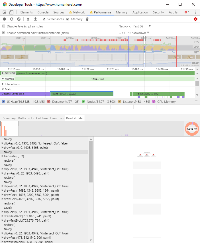
Use the tools to Chrome and Firefox developers to analyze loading and painting timesby adjusting the tests to see what happens on devices with more limited processing power and a slower network. In Google Chrome’s developer tools, the latter options appear by clicking on the red gear to the right of the “Performance” tab. Here, in addition, we have the option “Enable advanced paint instrumentation” that allows us to see the “Paint Profiler” tab when clicking on a paint event. This way we can see everything the browser needs to do to paint our page:
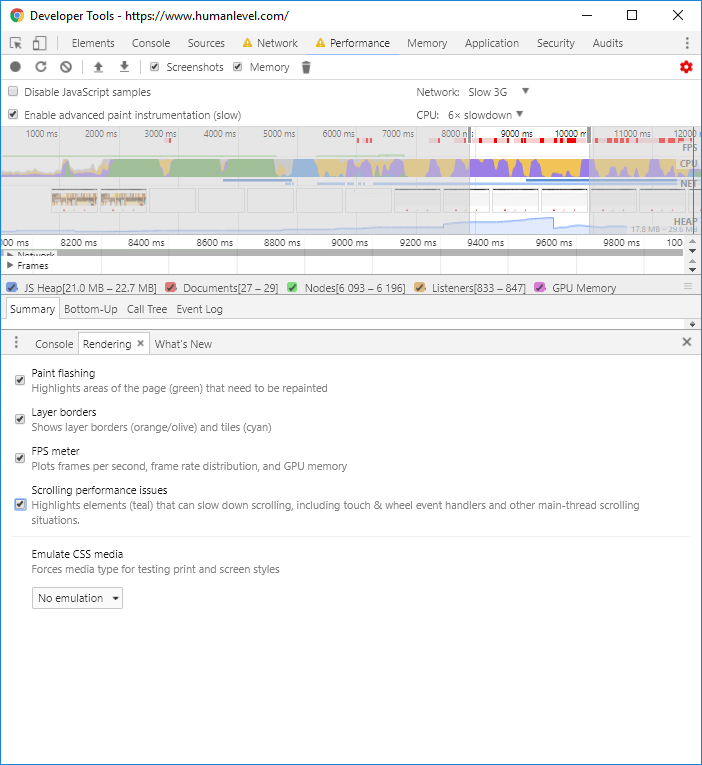
To study the speed of CSS and also how it is affected by JavaScript, it is very useful to use the options of the rendering tab. The software is also equipped with a number of other tools, which show us, among other things, in real time, which rectangles are being repainted on the page and the speed in FPS at which they are being painted. This option can be obtained by clicking on the same screen we see in the previous screenshot, on the three dots at the top right and clicking on “Show console drawer” and clicking on the “Rendering” tab:
Final recommendations
It is important to always prioritize maintainability over performance. Therefore, I recommend to always write the code as cleanly as possible, using some organization methodology, giving relevant names to classes and identifiers and, if you make the mistake of not using a preprocessor, at least put all tabs, line breaks and spaces, because later you will be able to minimize the code with a tool.
Always keep in mind the Amdhal law which reads as follows:
The improvement obtained in the performance of a system due to the alteration of one of its components is limited by the fraction of time that component is used.
This means that optimization of the most time-consuming part should always be prioritized. The most significant impact on the overall performance will be on the overall performance.