

Written by Jose Vicente
AMP (Accelerated Mobile Pages) is an open source initiative promoted by Google together with a large number of media worldwide and other technology partners. Aware that traffic from mobile devices has long been higher than from desktop computers and that sometimes browsing from mobile devices can be frustrating for the user because the sites are not always properly adapted for them, AMP was created with the aim of improving the loading speed of mobile web pages.
The recipe that AMP uses to improve the performance of mobile web pages is mainly based on the following elements:
- AMP HTML: this is a technology based on web components whose objective is to generate lighter HTML web pages. The use of HTML is restricted to the tags allowed in the specification, some of them have their equivalent such as the img tag
which becomes img-amp but in other cases such as object or frame are prohibited.
- AMP JS: as with the previous point, the platform provides the JavaScript resources necessary for the AMP HTML components to function. In this sense AMP restricts the use of JavaScript to its libraries.
- Use of caches: the use of the project’s own CDN allows this type of server to obtain the AMP pages, validate that their implementation is correct and, if so, save the response to serve it to the user in an optimal way. Validation implies that no use is made of external resources since the aim is that all resources are served from the same source via HTTP 2.0.
Although this idea may seem like an evolution of the mobile-friendly pages we all know, the idea goes further because it employs the use of the project’s CDNs to cache the content and serve it from there, in addition to the fact that the implementation must follow stricter rules by making use of the components offered by the AMP project.
Improved performance
 Let’s remember that the objective of all this is to offer simpler and optimized pages so that the response to the user from mobile devices is more agile. To achieve this, WPO implementation techniques are used. Here are some examples:
- Asynchronous JavaScript: we can only use asynchronous scripts. Recall that JavaScript code can block the construction of the DOM and this slows down the rendering of the page, resulting in a slower feeling of the page.
- Size of static elements in HTML: AMP decouples the presentation layer from downloading the static resources needed to complete it. In other words, it first downloads all the HTML and then downloads the necessary resources such as images, fonts, etc. AMP needs the size of static resources to be specified in the HTML in order to be able to optimize their loading.
- External requests are forbidden: the use of external extensions that due to additional calls and associated JavaScript can slow down page rendering is not supported. For specific extensions such as lightbox, sliders or embedding videos, AMP has specific elements for some of them.
Despite the simplicity and restrictions, AMP HTML offers tags to insert a good number of elements that enrich the content such as images, videos or ads from networks supported by this type of implementation. In addition, new components continue to be developed that will enable the use of new functionalities.
AMP SEO configuration
When implementing an AMP version of our content, we must keep in mind that it is still a copy of the pages we already have for desktop devices. Therefore the SEO configuration of AMP is similar to that of mobile content in separate URLs.
To see an example we are going to make a quick implementation using the AMP plugin for WordPress, with this plugin we can generate a basic AMP version of our posts. Google expects other CMSs to join the project and implement support natively or through plugins. Once installed and activated like any other WordPress plugin we only have to add /amp/ to the URL of any of our posts and we can see the AMP version of it.
Another option could be the AMP for WP plugin which has more configuration options. As you can see when browsing the AMP version its design is simpler than the responsive design, although with AMP plugins for WordPress it is already possible to include navigation elements such as the hamburger menu, related articles or comments.
More advanced plugins like this one even allow you to install exclusive AMP themes that allow for additional customization and a look and feel more similar to the responsive version of the content. As new AMP elements become available, it will be possible to incorporate new functionalities.
As we have already said, we must establish the relationship between the original and AMP versions by means of tags, therefore from all the pages of our site that have an AMP version we will include a link tag rel=”amphtml” whose href is the URL of the AMP version.
On the other hand, we must indicate with the canonical tag in the AMP version in which URL the equivalent content of the desktop version is located.
With this we suggest Google not to index the URL of the AMP version to avoid it being considered as duplicate content of the desktop version. But we must remember that it is not only about generating these alternative pages, but we must make use of the AMP HTML tags and programming standards for the implementation to be valid.
If we analyze the html code of the page we will see that AMP HTML tags are used where for example the html tag is accompanied by the term amp or img tags become img-amp. To see the official examples of use of the platform we can access the project page to create our first AMP page.
What about responsive design?
Initially, responsive design came with the idea of making the content of a Web site accessible from any type of device. But after a few years of experience , developers begin to suffer the headaches that come with adapting a site to each type of device. In many cases the problem lies just in that, the adaptation of an existing site to mobile devices without following a mobile-first design methodology, which on the other hand does not always make navigation from desktop devices optimal. With the arrival of new devices such as wearables or multimedia devices such as SmartTVs, the problem has become more pronounced and it is clear that it is difficult to adapt the same content to different devices from which users also tend to have different content needs for the same page. It is therefore necessary to continually update the design of our site to meet the access needs of our users, taking into account new frameworks that appear and thus increasing the load of code in many cases, which negatively affects the loading time of our site and therefore the WPO. Therefore we see that responsive design is not the panacea and AMP comes to fill the gaps that this philosophy of design and development of Web sites is not covering optimally.
 AMP in SERPs
 AMP in SERPs
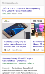
Google displays AMP pages in search results using a horizontal news carousel for searches from mobile devices.
As happened with the incorporation of the Google News block in the organic results, this carousel shifts down the organic results showing only the media that have adapted their news pages to this new technology. This should result in a reduction of impressions and clicks even if the media in question manages to appear in good positions above the news carousel, since the carousel always includes an image of the news item, which improves the visibility of this type of results.
By clicking on one of these links we access the news without leaving Google because it actually serves the content from the AMP project’s CDN making use of a iframe and keeping a blue bar at the top of the page to return to the search results. From within the news we can access the rest of the news in the carousel by scrolling sideways, which favors navigation to related news in competing media. 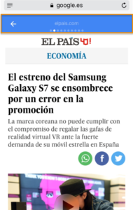 If we click on any other link on the page, this content will open in a new window and in that case we will access the content from the content owner’s server.
This approach improves loading speed, which reaffirms Google’s belief that faster sites are more popular with users, but it is also a way to improve the speed at which the site loads. there are limitations that may not be so well received such as the fact that the content is served from Google’s servers, escaping the control of the medium, or the current reduced possibilities of analyzing traffic data if we use one of the analytics platforms that are not associated with the project.
At the moment there is no confirmation from Google that AMP will be used in the rest of the Universal Search modules, so currently the focus is centered on the media and its incorporation through the Google News module. But if, in the future, its use is considered in other modules, the media that obtain traffic from them will inevitably be forced to implement this technology on their sites if they want to maintain their visibility.