Written by Raúl Carrión
 If you own or manage an online store, you’ve probably spontaneously developed a morning routine of analyzing Google Analytics KPIs (key performance indicators) while holding a steaming cup of coffee in your other hand.
Well, there is a fantastic way to have all this data in a single Google Analytics screen, with all the advantages that entails:
- Now reviewing the indicators will take much less time.
- Seeing all the data on a single screen will help us find correlations between data and make better decisions.
- We will have the other hand free to dip cookies in the coffee.
Discovering KPIs
If you have been in the wonderful world of online stores for some time, it will be clear to you which are the most important data to know the state of health of your e-commerce. If, on the other hand, you have just arrived, in this article I propose the KPIs that I find interesting. However, it is important to know that the KPIs to be measured may vary depending on the characteristics of your online business, sales volume, etc.
Next I will detail which are the interesting KPIs to analyze on a daily basis for a newly created online store, focused on the domestic market, with a view to attack other countries in the medium term.
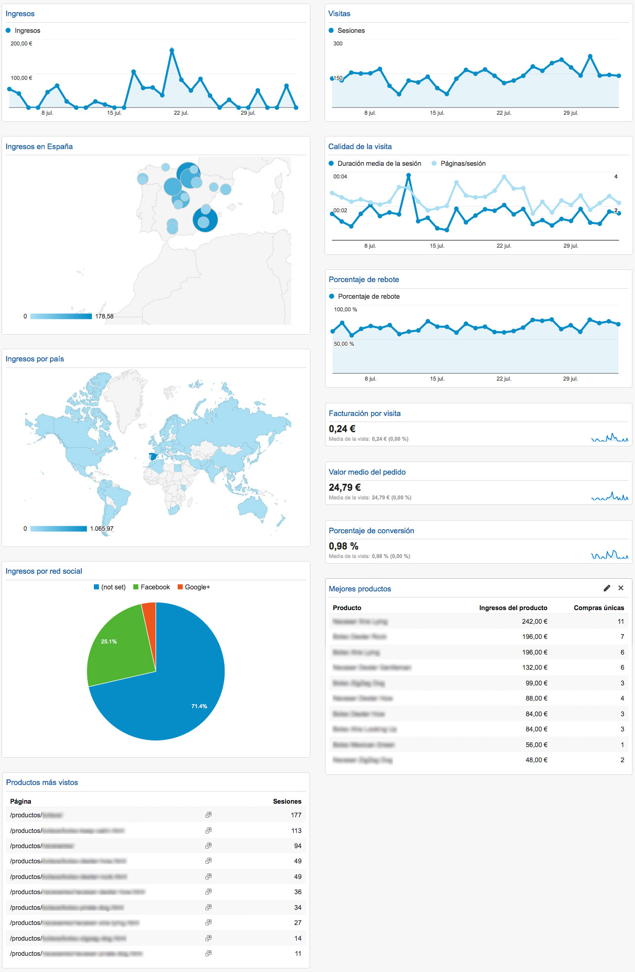
Revenues
Turnover per day, the key data that gives us joy and sorrow every morning.
Revenues in Spain
Map that will reflect the areas where our business volume is higher. This map is important to undertake market research to help us:
- Knowing why we sell so much in some cities. It may be due to product issues: it sells better in cold areas, near the beach, local holidays, etc.
- Evaluate opportunities for business expansion or reinforcement of the area. For example, if we sell a lot in a city, we could consider creating a physical store. Or if we don’t sell anything somewhere we feel we should sell, we can reinforce online marketing with a targeted Google AdWords campaign.
Revenues by country
With this map, we will be alerted to an increase in sales in a particular country. If we sell in another country without having organized it consciously, imagine how it can work with a specific strategy.
Revenue per social network
Like everything else, it will depend on the type of product we offer, but it is common that in a newly created online store one of the first sources of visits and therefore sales are social networks.
Having a pie chart -also called a cheese chart for the more romantic ones-, will be useful to know what volume of business we move thanks to our social profiles.
Visit
Obviously this data cannot be missing in our panel. We will see how visits evolve over the days, quickly detecting unusual increases or decreases in traffic.
Quality of the visit
In the same graph we will show the average session duration and pages/session. These two overlapping series will help us to quickly detect if there is an anomalous decrease in page views or in the time spent by our users on the web.
Bounce rate
Do users find what they expect when they access our website? With this chart we can know if our marketing strategies are driving interested customers to our store or if we are misdirecting our efforts by pushing users with no purchase intent to our business.
Invoicing per visit
The quotient resulting from dividing the total turnover by all visits is a measure of the quality of our traffic. The higher this figure is, the better.
Average order value
It goes without saying that the higher this value the better for us. If we want our customers to buy more from us, we can use cross selling, up selling or free shipping promotions from a certain amount.
Conversion rate
The percentage of visitors who end up buying. In my experience this figure usually ranges from 0.5 to 4.5 for Spanish online stores. Some of the determining factors are the power of the brand, the online store platform, the marketing strategy or the type of product.
Most viewed products
List of the most visited product pages. Sometimes we can be surprised to find that the products that receive the most visits are not the ones that generate the most sales. In that case we have two tasks pending:
- Work to increase conversion on these products by optimizing your tab / page.
- Work to ensure that the best-selling products are positioned equally well.
Best selling products
We show the product name, revenue per product and the number of unique purchases. With this KPI we easily identify which products are performing best in our online store. This data is interesting by itself, but if we cross it with the previous table, we will see which products are not generating sales in spite of bringing a lot of traffic and on the contrary, which products are generating sales in spite of having a reduced volume of traffic.
How to set up the online store dashboard in Google Analytics
Creating the dashboard is very simple, we just have to access our Google Analytics account and in the left column, click on Dashboards / New Dashboard.
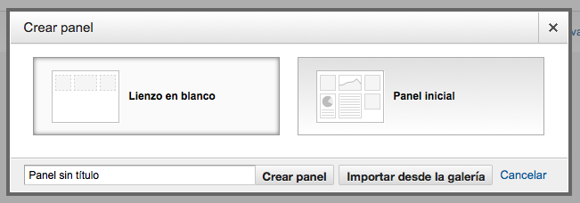
- Select “Blank Canvas”.
- We call the panel “Online Store” or whatever we like.
- Click on the “Create panel” button.
At this point of the configuration you should know that Google Analytics has an extensive gallery of panels developed by other users that you can apply to your account with just a couple of clicks. I recommend that in addition to the creation of your custom panel for online stores, you visit the gallery and install several panels to check the full potential of this functionality.
Returning to the configuration of our customized dashboard, in the next step we will add a widget for each KPI we want to take into account. When creating the panel, Google invites us to create the first widget. If it seems to you well we are going to create the widgets in the same order that we have commented them previously. For each of them I indicate below what to select in the widget configuration panel.
To add a new widget, click on the “+ Add widget” button located in the upper right corner, bearing in mind that a panel can have a maximum number of 12 widgets.
Revenue widget
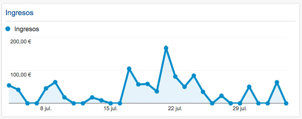
- Widget title: Income.
- Type: Standard / Chronology.
- Configuration. Generate a graph of the following metrics over time: Revenue.
- Link to report or URL: Conversions / E-commerce / Transactions.
Revenue widget in Spain
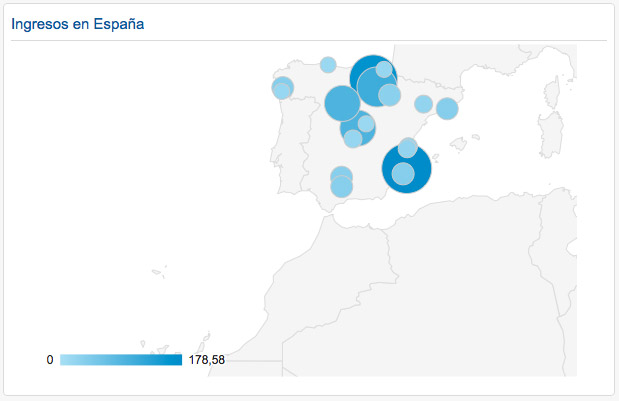
- Widget title: Income in Spain.
- Type: Standard / Geomap.
- Configuration:
- Metric selected to represent: City / Income.
- Select a region: Spain.
- Link to the report or URL: Audience / Geographic information / Location.
Revenues by country
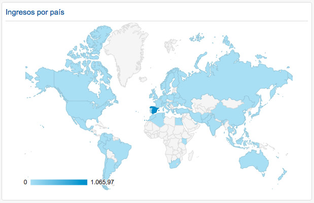
- Widget title: Revenues by country.
- Type: Standard / Geomap.
- Configuration:
- Metric selected to represent: Country / Income.
- Select a region: World.
- Link to the report or URL: Audience / Geographic information / Location.
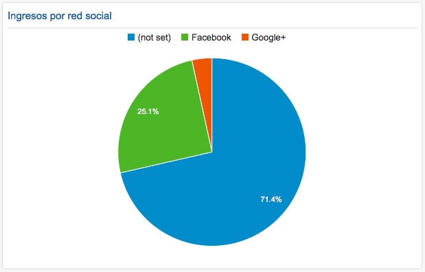
- Widget title: Revenue per social network.
- Type: Standard / Circular.
- Configuration:
- Create a pie chart showing: Income.
- Grouped by: Social network.
- Link to report or URL: Acquisition / Social / Conversions.
Visit
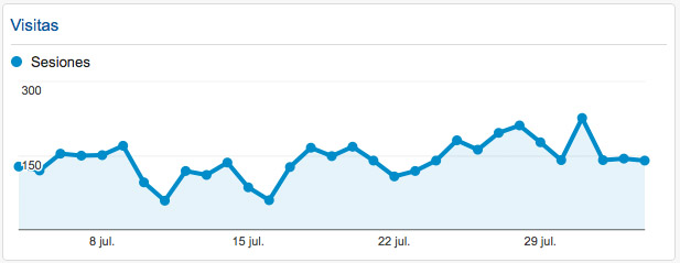
- Widget title: Visits.
- Type: Standard / Chronology.
- Configuration: Create a graph of the following metric over time: Sessions.
- Link to report or URL: Audience / Overview.
Quality of the visit
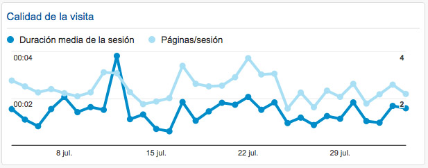
- Widget title: Quality of visit.
- Type: Standard / Chronology.
- Configuration
- Create a graph of the following metric over time: Average session duration.
- Compare to: Pages/session.
- Link to report or URL: Behavior / Overview.
Bounce rate
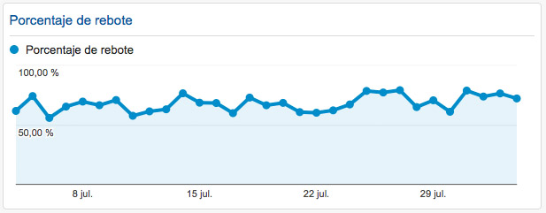
- Widget title: Bounce rate.
- Type: Standard / Chronology.
- Setup: Create a graph of the following metric over time: Bounce Rate.
- Link to report or URL: Behavior / Overview.
Invoicing per visit
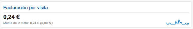
- Widget title: Invoicing per visit.
- Type: Standard / Metric.
- Configuration: Display the following metric: Value per session.
- Link to report or URL: Conversions / E-commerce / Overview.
Average order value
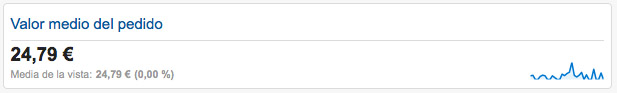
- Widget title: Average order value.
- Type: Standard / Metric.
- Configuration: Display the following metric: Average order value.
- Link to report or URL: Conversions / E-commerce / Overview.
Conversion rate
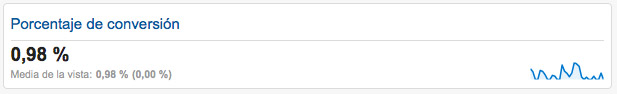
- Widget title: Conversion rate.
- Type: Standard / Metric.
- Configuration: Display the following metric: Percentage of e-commerce conversions.
- Link to report or URL: Conversions / E-commerce / Overview.
Most viewed products
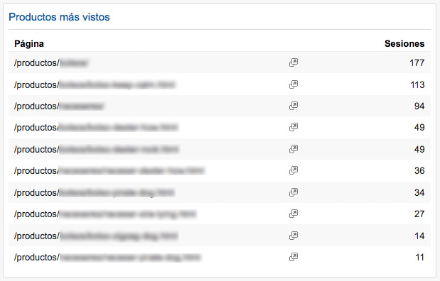
- Widget title: Most viewed products.
- Type: Standard / Table.
- Configuration:
- Show the following columns: Page / Sessions.
- Show table with:10 rows.
- Filter this data: Show only page containing /products/.
- Link to report or URL: Behavior / Site content / All pages.
Best selling products
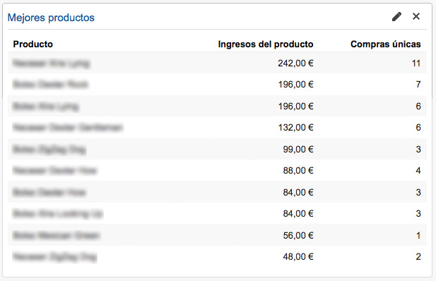
- Widget title: Best products
. - Type: Standard / Table.
- Configuration
- Show the following columns: Product / Product revenue / Unique purchases.
- Show table with:10 rows.
- Filter this data: Show only page containing /products/.
- Link to report or URL: Conversions / E-commerce / Product Performance.
Once the widgets have been created we can drag and drop them to arrange them as we find most useful. I personally like to group revenue widgets on the one hand, visits and quality on the other hand and products on the other.
And that is all. Simple, isn’t it? Here is a screenshot of how the panel would look like and for any questions or recommendations you have the comments at your disposal.