

Written by Rubén Martínez
Index
- Elements that should appear on the product page
- Include all the information about the product in the product data sheet.
- Include information on deliveries and returns
- If there is no stock, show it in a clear way
- Zoomed images
- Wish or follow-up list
- Reduce user typing
- The call to action is visible and eye-catching
- Allow customer reviews
- Page download speed
- Save session information
- mCommerce always in mind
Following the basic guidelines recently published by Google about usability optimization mobile in eCommerce, we present and detail a series of improvements for product sheets of retail websites. These improvements are aimed at offering a more advanced user experience on mobile devices and therefore promoting conversion by making the purchase process as easy as possible.
The product sheet is the last stage of the customer journey before making a purchase and getting a user to this point is a difficult journey. Therefore, once you are here, we must work as hard as possible to focus all your attention on completing the conversion and make this decision as easy as possible.
While in a previous article we talked about optimizing product pages on desktop devices, today we will discuss this topic from a mobile point of view.
Elements that should appear on the product page
The sticky menu is a header that appears at all times at the top of the screen.even if the user scrolls down, which will contain essential elements such as the hamburger menu display link, the internal search button, the logo and the link to the shopping cart.
On the above the fold
The above the fold is the default area that the user sees on their device when the page is downloaded. In an ideal situation, this area should contain:
- The breadcrumbs
- Product image
- A discreet add to wish list button
- The name of the product
- A short description
- Star rating
- The price
- Availability if not in stock
- The buy button (can be made floating so that it doesn’t disappear)
Below the fold (the bottom of the page that cannot be seen without scrolling) will contain other elements such as sizes, colors, availability by features, long description, shipping and return information, and related or recently viewed products.
Include all the information about the product in the product data sheet.
We will try to provide the customer with all the information that may be of interest in a concise and well-structured manner. We can modify the way the information is presented compared to the way it is presented on desktop, but we will never remove any important data. In the case of an item with different sizes, many online stores present a grid in which it is easy to find the sizes that are available.
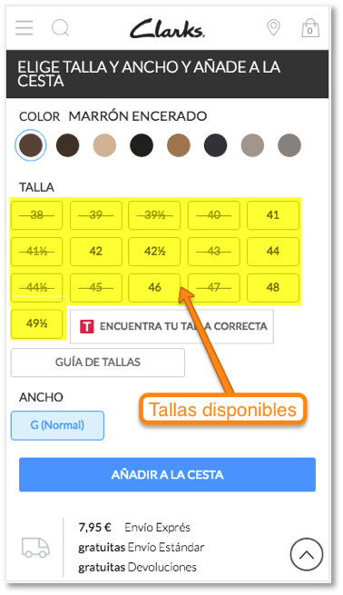
As we can see in the screenshot above, the user must interact by selecting the desired color and later its size. The rest of the page is composed of interesting information for the customer, but without hindering the purchase, since the texts are under accordions that we can click to display the content, but we will not see if we do not do it. In terms of usability, this is very positive since we lead the user to the purchase through the most comfortable way and in terms of SEO, this fact does not have a negative impact.
Additionally, we have two links. One of them leads us to an application that helps us find our perfect size in the Clarks brand from size data on other popular brands. This information remains in the file until the purchase is completed. The other link is a size guide based on our foot measurements in centimeters.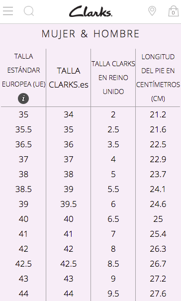
Relevant characteristics of a product by type
In the case of a shoe, we can be satisfied with knowing the material it is made of, the color and the size; however, in other types of products, we will give preference to other characteristics that have a greater influence on the customer’s purchase decision. For example, if we are going to buy an electric guitar, it will make more sense to talk about the length of the neck, the body material or the style of tuning pegs.
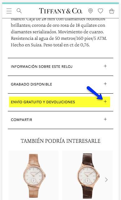
Include information on deliveries and returns
To avoid the slightest doubt that may appear at the moment of adding the product to the cart, we must expose at a very small distance from our area of action the information related to shipping costs and delivery times, returns, etc. and other data that can promote the purchase decision.
If there is no stock, show it in a clear way
If the item in question is out of stock, this should be prominently displayed as soon as possible. In the following example, the “product out of stock” message is visible, with a considerable size and in capital letters, however, we could improve it by placing the message in a higher position and highlighting it with a shading or a more evident color.
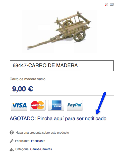 The “Out of stock online” notice occupies minimal space and is located in a low position. In short, just the opposite of what we should be doing. Within the list of products of that category, it will be interesting to apply a sorting so that the out-of-stock products appear at the end.
Zoomed images
We are all visual consumers and we are inevitably driven by our eyes when it comes to purchasing a product. Since online commerce has the handicap of not allowing direct visual contact between the customer and the product itself, the image will be the first place the eye will go to.
A well-lit photograph, with the product in a suitable position, with tones that are true to reality and in which the object occupies the prominent place, will count as a plus point. If we add to this the possibility of displaying the image at a larger size and in high resolution to make it easier for users to get closer to the product, they will be able to make a more detailed visual review.
If we are going to buy a high-end branded gold bracelet, we will want to make sure that all the nuances are perfect, that there is no flaw and even that the brand name appears on the bracelet to give it more prestige.
In the above screenshot, we can easily see the three buttons under the image, indicating that there are three photographs that can be accessed by clicking on them.
Wish or follow-up list
The wish list is a feature that allows users to create a list of items that they have liked in order to follow up on them, being able to receive email notifications about stock availability, price drops or last units.
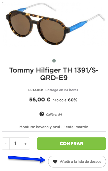
This option promotes user interaction with the website or app, so that you can bypass your browser’s bookmarks to store products that are pending purchase. In addition, it will be useful to collect data about what customers like and then use this information to carry out promotional actions with related products.
Given that mobile traffic has already surpassed desktop traffic, it is not worthwhile today to consider an online store project without starting by prioritizing optimal navigation for smartphones.
Reduce user typing
As far as possible, we will replace the fields that require typing by the user, as this causes most of the errors in the purchase process. Instead, we can add buttons to help increase and decrease the number of products to be added to the cart.

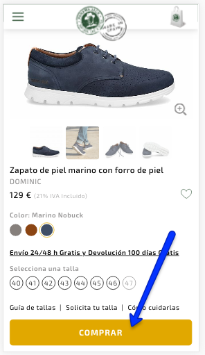
The call to action is visible and eye-catching
Following the guidelines of guiding the customer towards conversion, highlighting the buy button is something that should not be overlooked in any case. This button should represent a very clear call to action where the user’s eye lands in the first seconds of the visit to the page. Using a button background color that matches the design of the site and is not used on any other element of the page will ensure that attention is never lost.
Allow customer reviews
Giving the possibility for a customer to freely write his personal evaluation of his purchase is something that humanizes companies and brings them closer to the public. In a short time, starred reviews have become one of the main values for users, who can consult the opinions of other people who have bought the item they are looking for before. Aware of the importance of this aspect, companies are working to improve after-sales services and customer service to avoid negative feedback as much as possible.
Page download speed
In order to reduce the load of our product page as much as possible, we will have to make sure that we comply with the following guidelines:
- Related to images:
- Their size is the maximum size at which they will be displayed on the screen.
- They do not occupy more than 200KB each.
- No more than is strictly necessary to influence the sale.
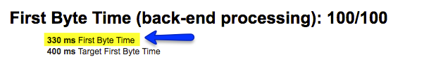
- The server response time is between 100 and 500ms. It can be checked with the tool https://www.webpagetest.org/.
- There are no unnecessary modules/plugins whose loads may slow down the speed.
- Related to JavaScript and CSS codes (see this CSS optimization guide):
- There are no functions that are not used.
- They are not embedded in the HTML.
- They have been reduced to the smallest possible number of files.
- There is an effective caching system, such as Express Cache for Prestashop or W3 Total Cache for WordPress.
If we find ourselves in a case where we do not know what is the reason for the slow loading speed of our website, we can start by activating the debug mode of the site to see exactly where the slowdown occurs. Most current CMSs come with an option to easily activate this mode.
Save session information
For different reasons, a user is more likely to suffer a loss of internet connection from their smartphone than from their home computer. If at that moment we had any product added to the cart, we will not want it to be lost, so we will have to store that information in a session so that it can be retrieved after the connection is reestablished.
mCommerce always in mind
mCommerce or Mobile Commerce is e-commerce through mobile devices. Technological advances in accessibility and security have increased the confidence of consumers, who in recent years have been making increasing use of their smartphones to carry out transactions of all kinds.
Given that mobile traffic has already surpassed desktop traffic, it is not worthwhile today to consider an online store project without starting by prioritizing optimal navigation for smartphones.
To fold these mobile PDP improvements into a broader strategy, check our e-commerce SEO optimization.