

Written by María Navarro
Index
With the new year just around the corner, we want to bring you an article with web design trends for 2018. It must be clear that when we consider developing a website or renewing the existing one, the goal should be to balance the aesthetics with the functionality of the website. It is true that this is sometimes a difficult act, but if it is done well, you will increase user participation and achieve higher conversion rates.
Mobile-oriented design
The web design optimized for mobile devices has increased in recent years, it is an upward trend as currently about 60% of all searches are made from mobile devices. In addition, Google has announced that during 2018 it will launch Mobile First by moving to give more importance to the mobile version than the desktop version and to put well-optimized sites for mobile first in search results.
Consideration should also be given to the implementation of AMP which allows websites to load quickly on mobile devices. We users are increasingly impatient and want everything right away.
Building on this foundation that mobile-first development should come first, the trends in 2018 revolves around this with simple and clean designs.
Minimalist design
Although 2017 already started with this trend, in 2018 it is the maximum.
The goal of a designer is increasingly to look for a beautiful and dynamic design that also coexists in harmony with a good mobile performance.
Users are becoming more and more impatient, so we must ensure that a website loads fast at all costs, especially on mobile devices. One way to achieve this is to reduce the load of graphic elements.
Lightweight and fast-loading designs make page optimization and speed much better, which Google and other search engines will thank us for. A faster loading time means that Google will consider us better for positioning, also increase the chances that users stay on the website longer, which will lead us to improve the conversion rate percentage.
A minimalist design does not have to be sad or boring, the trend is to use bright colors with contrasts and linear illustrations creating attractive designs for the user.
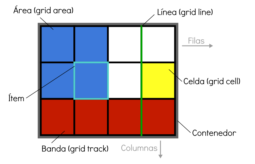
Irregular grid
Most of the existing templates for WordPress content management systems are designed in grid with columnar layouts. In early 2017, the CSS grid began to be introduced. This type of grid is a much more powerful system that allows you to work in both columns and rows.
The trend in 2018 is to use more irregular grid layouts, white space that makes content stand out and easy to read and navigate, which helps users stay on the website longer.
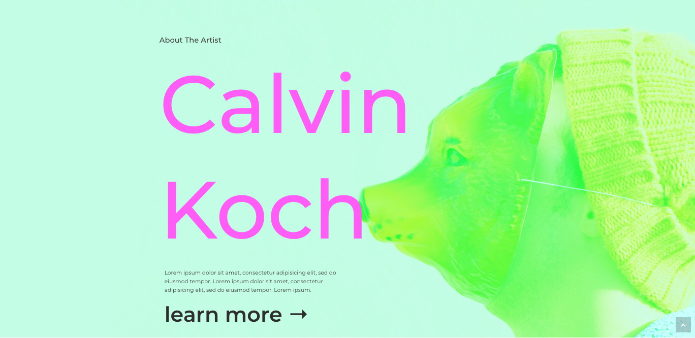
Expressive typography, bright colors and bold fonts
In 2018 designers are going to have to unleash their creativity with typography. The trend in typography is to use bold font styles along with white space, play with bold and brightly colored fonts to make it easier for the user to read. The use of banners, images and large heavy buttons should be reduced, giving way to typographic expressions. The benefit of a more font-based design is that, by scaling the font size, it does not affect the performance for mobile devices, as well as avoiding the loading of too many images.
In terms of color, flat colors are replaced by multicolored gradients in good combination and harmony.
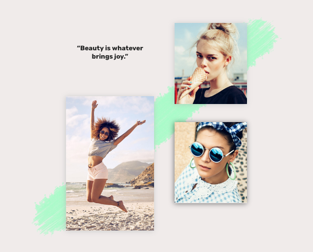
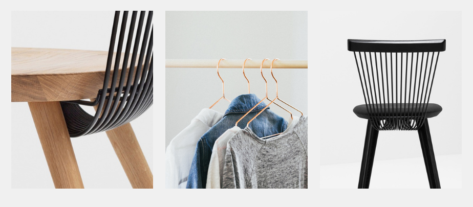
Unique images and graphics
As we have already mentioned, the trend of using banners and images will decrease, but they will not disappear, but will give way to unique graphic illustrations or images accompanied by an identifying touch of the brand. Less stock photos and more unique and original handmade designs. Creativity to the power. At the level of icons will be linear, line art is in vogue.
At this point you will say it is impossible to have an online store without product images. Right. The trend in product images is to take unique and eye-catching photographs that differentiate us from the competition. This differentiating touch is important. The product image is a decisive factor in the purchase decision, as more than 60% of users see the product image as a decisive factor. We buy through our eyes!
Scrolling animations
Scrolling animations and interactive elements on the web increase the user’s stay on our site. A great example of scrolling animation can be found at https://www.apple.com/mac-pro/.
As in the previous points, we are looking for a minimalist and strategic animation that will lead to an increase in conversions.
Animated Logos
The trend in logos for 2018 is animation. Dynamic images are easier for our mind to remember and understand. With an animated logo we can achieve transitional colors, emotions through images and help to better define the business to potential customers. The objective is to transmit positive emotions immediately. In addition, we play with the novelty of surprising the user, as this is not currently a common practice. Simple and elegant animations should be worked on.
SVG vector graphics
PNG and JPG images are left behind, giving way to SVG vector images. Files with this extension are easy to scale and do not lose quality. Moreover, their size is smaller and if they contain animations they do not affect the loading speed because they do not require any HTTP request. For 2018 SVG files will be the best format to choose for graphic elements.
Progressive web applications
In the next year we will see an increase of hybrid websites between mobile and web applications, the so-called Progressive Web Apps. This trend will include elements such as push notifications, animated page transitions and splash screens.
Some of the benefits of using a Progressive Web App are:
- Faster charging even with poor connection.
- Mobile home icon.
- Send relevant push notifications.
- Loads as a full screen experience on mobile.
As you can see, all design efforts for 2018 are geared towards improving usability and loading speed on mobile devices.