

Written by Ramón Saquete
Today I am going to talk to you about very interesting Web analytics tools to obtain information that will allow us to optimize the usability and conversion rate of our Web site. I am referring to tools that use mouse tracking to generate heat maps.
When our eyes fixate on something, within a few milliseconds we move the mouse to the same position.
The idea of mouse tracking comes from eye tracking, a technique for usability testing that requires using cameras to follow the movement of the eyes while the user interacts with the application to determine the user’s intentions.
There are several scientific papers showing that mouse movements are highly correlated with eye movements. The most prominent papers on this topic, from Carnegie Mellon University, have been presented at the annual Computer Human Interaction conference, where they continue to study how to determine eye movements from mouse movements. Apparently, when our eyes fixate on something, within a few milliseconds we move the mouse to the same position. Therefore, mouse tracking allows us to know how the user interacts with the page. Although this cannot replace the classic usability test where the user is asked what he/she thinks while interacting with the page, it can provide interesting information about his/her tastes, intentions and ways of interacting.
There are a number of tools that allow us to obtain this type of information from our Web site (ClickTale, Crazy Egg, Clickdensity, Feng-GUIetc.). All of these tools are paid, since they have to handle a wealth of information and display it in an intelligible form to the user, for which they need powerful servers. Normally, in this type of tools, we will find at least three types of graphs:
Heat maps of mouse movements
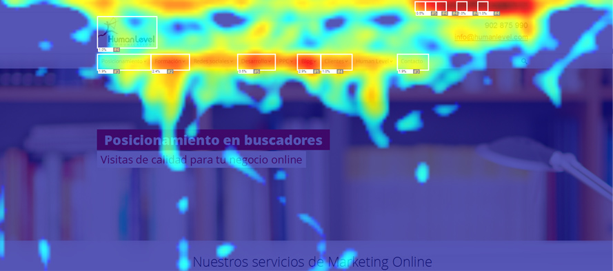
They show in red the areas where the most users have passed the mouse and in blue the areas where the least users have passed the mouse.
When interpreting the data on this type of chart, we will look at both the red and blue areas, especially if the latter are on elements that we expected to stand out. In this way we will be able to determine which sections of the menus arouse more interest to users, locate strategic places to place banners, the type of photo that attracts more in the articles of a store, detect if they get stuck filling out a form, etc.
We must be careful with drop-down menus, popups or other hidden elements, through which the user may have been moving the mouse and which may appear as red areas that apparently have nothing underneath. In these cases, the analytics tool can give us the option to show the hidden elements of the page.
It should also be noted that we will not have information from mobiles and tablets, as mouse movements should not be combined with finger movements. In addition, to avoid problems with responsive designs, these tools often capture only mouse movements when the page is at full resolutionThe data can then combine the movement information with a single layout of the page elements, as otherwise we would have inconsistent data.
Click maps
 It shows us the points where users have clicked and can include the percentage amounts of clicks or the number of clicks made on each link.
It is often of interest that the analytics tool allows us to superimpose this type of graphic on the heat mapThe map of the mouse movements tells us what he was interested in the user while moving around the page, even though this may not match the items they eventually click on.. Usually, the two measures have a very strong positive correlation, but this may not be the case.
This type of graph will reveal usability problemsas elements that look like buttons and in reality they are not (occurs when we have many clicks on non-clickable areas), or elements that are buttons but do not look like buttons (occurs when we have links or buttons that do not receive as many clicks as we would expect).
Scroll bar heat map
This graph shows in red the area that users see the most, according to the scroll bar displacement.
This type of graphic serves mainly to check if we are complying well with the rule that the most important content should be at the top and should be seen without the need for the user to scroll, it is said that the content must be above the fold. We may have items that we think fall into this zone for the vast majority of users, but are actually too far down.
Conclusions
The more information we can obtain from our site , the greater the value of the conclusions we draw for decision making. In this sense, heat maps and click maps are one of the most important sources of information for this task.
For the study of usability and user behavior, it would be more interesting to be able to see the path followed by each user or even see in real time the entire navigation, but some users may consider the collection of this data as a violation of their privacy.
Analytics tools only allow us to obtain statistics of accumulated data from several thousand users, but it is not superfluous to indicate this practice in the privacy policy of our website.