

Written by Ramón Saquete
Index
Improved usability in forms is synonymous with improved conversion, since by reducing the difficulty of purchasing or submitting contact data, the number of users who manage to complete these tasks increases. On mobile devices, this is much more difficult, and therefore we must take some additional considerations into account.
The subject of usability is very broad and has many books written on it. Making it easy and intuitive for the user to use our web application is complicated, even more so when they have to fill in data on a small screen at the touch of a finger. As general recommendations, we have to make sure that users have to perform as few actions as possible and make them think as little as possible, otherwise they will end up frustrated and give up trying.
In the following, I will focus on the technologies and patterns that I consider indispensable when it comes to improving usability on mobile and tablets, but most of them are also applicable to desktop web applications.
HTML5 field types
Before the arrival of HTML5, if we wanted to enter a phone number, a zip code, a date or email, we used text fields as follows:
<input type="text" id="cp" name="cp" />
We can now use the following specialized types:
Telephone: type=”tel”
Number: type=”number”
URL: type=”url”
Email: type=”email”
Date: type=”date”
If the browser does not recognize any of these field types, it will assume that it is of the text type. The complete list can be found here.
The advantage of these types of data is that a different keyboard will appear on the cell phone for each of them. That is, a numeric keypad for the telephone, a keypad with the at symbol for email or the “.com” button for the URL type. This will make it easier for the user to fill in the data.
When using them we have to be careful with desktop behaviorfor example, if we set a zip code as type “number”, in desktop we will have buttons to increase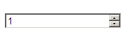 decrease and decrease the value in a unit, being something that in this case does not make much sense, so we can detect what type of device we are in and if it is on desktop use the text type and if it is mobile use the “number” type. Example:

Another case where we have to watch whether we obtain the desired behavior is the date type. To implement such a field, we have always used calendars generated using desktop UI libraries in JavaScript, which always show the same calendar adapted to the application layout, but these calendars are not suitable for mobile because they are too small.
If we use a field of type date, in mobile, we will have calendars with a different interface depending on the device, but much more usable:
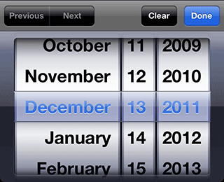
Likewise, with the date type, on desktop we will have a different calendar depending on the browser, without the corporate colors. So, if we want or if the browser does not support the date type, on desktop we can discard the use of this data type and continue using the JavaScript library.
Another option is to use JavaScript user interface libraries for mobile, with which we have calendars similar to those shown on the device. In the case of mobile, it is always better to use HTML5 data types instead of libraries, even if we cannot use corporate colors, because this way we do not have to resort to additional code that slows down loading and consumes battery power. With the advantage that the user will see a control to enter dates that he will have already seen on other websites and will be more accustomed to.
Auto refill
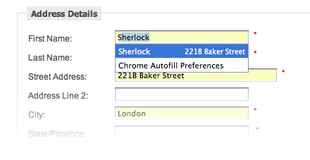 Autofill is a new5 feature that allows you to automatically fill in all the fields of any form, with the data captured and stored in the browser, from other forms that we have previously filled in. If we wish, we also have the option of entering our data manually in the browser.
This functionality is active by default in the latest versions of Google Chrome and Firefox for both mobile and desktop, in Internet Explorer and Safari we can activate it.
When autofill is active, the browser displays a drop-down list when you start typing in the first field and selecting an option will fill in the rest of the fields with the associated data.
The autofill tries to guess what data corresponds to each field by the names they have in the code, but we can indicate in the html exactly which field it is by adding the attribute autocomplete=”field name”. For example, to autocomplete with the credit card number we would have a field like the following, where we indicate that the field should autocomplete with the value stored for “organization”.
<input type=”text” id=”company” name=”company” autocomplete=”organization” />
The complete list of values that the autocomplete property can take can be found in the WHATHWG specification.
Labels with associated fields
Form labels must always be associated to the field they refer to by means of the “for” attribute of the “label” tag, so that the user can always click on the label to go to the field. In checkboxes, especially on mobile, this is especially important, as it will be much easier to click on the label than on the checkbox itself. Examples:
Passwords without asterisks
Password fields have always been used for passwords, which are of the type “password”. show asterisks instead of the password to protect us from prying eyes, however, we have on the mobile this does not make as much sensebecause they are more personal devices and it is easier to make mistakes when writing, that is why it is usually included a checkbox that changes the field type to “text” so that we can see what we are entering. It is also a good option not to hide the password after a failed login attempt.
Fields for self-growing comments
The multi-line text fields that are used to enter comments show scroll bars when we go over the preset size, these bars are quite uncomfortable on a small screen, but there are many JavaScript libraries to make “autogrow“in the “textarea” of the form that the field grows as more lines are required.
Autocomplete
When the list of values that can be typed by the user is very long, a list of possible values for the first letters entered is usually displayed via AJAX. In these cases, when the user selects the field, we must place the scroll so that the field is at the top of the page. If this is not done, there may not be enough space to see the drop-down list due to the space occupied by the keyboard on the screen.
Some more tips
- Delete button: in free text fields, it is a good idea to include a button with a cross at the end of the field so that the user can easily delete what he/she has written.
- Watermark: using the “placeholder” attribute of HTML5 we can put a text inside the field indicating that it shows an example of what is to be entered there. Example:
- Highlight the focus: with CSS we can change the style of the field that currently has the focus using the pseudo-element “:focus”, thus helping the user to locate it.
- Bring the focus to the first field: with the autofocus attribute or with the “focus()” method of JavaScript we can select the first field of the form when loading the page. Note that this is only useful if it is the only form on the entire page and when loading the page, you can see the field first, without scrolling down.
There is usability considerations, in addition to those mentioned above.It is important to explain at the beginning what the form is for, use forms in a single column, group mandatory fields, retrieve information from social networks or infer information such as the province from the zip code, etc., so do not stop testing, reading and researching.