


Tabla de contenidos
Google Trends is a free and essential trend monitor in the research phase of any online marketing strategy. With Google Trends we can know the volume of searches on a particular term in relation to the total number of queries that have been made in the Google search engine during a given period of time and place. In other words, it allows us to accurately measure the interest that a concept has aroused among users.
One of its best-known applications is found each year in the Zeitgeist Reports, in which Google gathers the main topics of the previous year through users’ search trends.
Main features of Google Trends
Its interface has undergone several modifications (the last one just a few weeks ago), but the usability of the tool has hardly changed over time, being divided into four main navigation areas:
Search and filter area
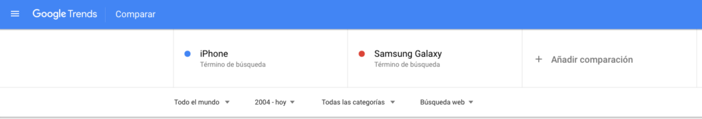
In this section we will include up to a total of 5 keywords that we wish to analyze and a color will be assigned automatically. Once entered, we can narrow down the analysis of the term using the suggestions provided by the tool.
In its lower part we will find different filters that will allow us to segment our analysis:
- By country or globally.
- Per period of time. We can choose between different determined time intervals (from 2004 to the last hour) or a customized interval.
- By thematic category. Very similar to what we can find in other tools such as Google Keyword Planner. Thanks to this filtering, we will be able to avoid ambiguities in our analysis.
- By type of search, specifying whether it is a general text or image search, Google News, YouTube videos or Google Shopping.
Graph of interest over time
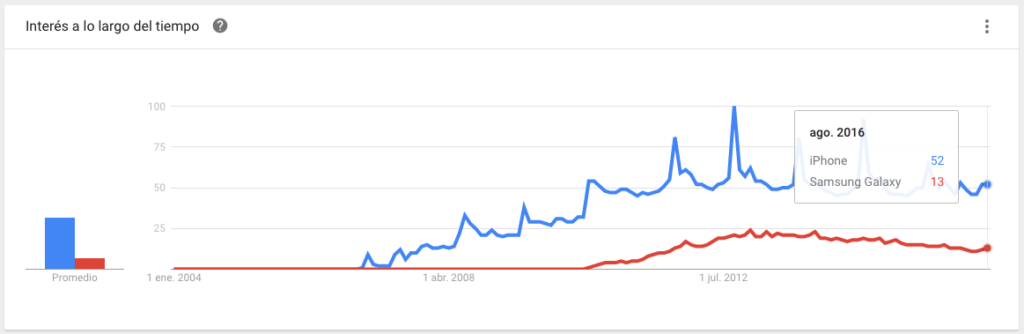
This is the most popular area of the tool, where a line graph shows the evolution over time of the different search terms entered. The vertical axis measures the interest aroused by each keyword, while the horizontal axis represents the period of time we have selected in the search filters. If we move the mouse pointer over the graph, the tool will show us a small table with the quantitative value of the relative volume of searches performed (over the total number of searches) for each term at a given moment in time (month, fortnight, day or even hour) in which we are located.
In addition to the main graph, on the left side you will find bars with the average search volume for each term. This small graph can be very useful as a general summary or for comparisons with many variations in which the main graph is not very clarifying.
Graph of Interest by region
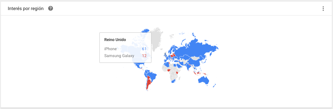
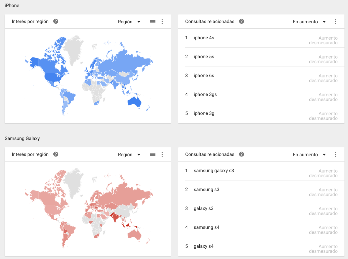
In this area we find most of the new features compared to the previous version, both in the way of representing the results and in the navigation through them. In it we find a heat map in which each country (or sub-region, depending on the filtering performed) will be colored with the color assigned to the most popular search term in the area. As in the previous graph, hovering over any region with the mouse pointer will display a table with the average relative value of the search terms entered. Clicking on a country or region will take you to a new analysis of the same search terms with the filter for the selected region active.
In my opinion, thanks to the new features introduced, it has become an area with great potential for analysis, since it shows in a very visual way a global comparison between different terms. Some of its practical applications will be discussed below.
Related topics and inquiries
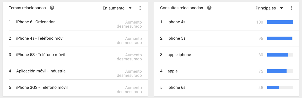
In this last area we will find 2 tables with Related Topics and Queries related to the search terms we have entered. Similar to the other graphs, an indicator next to each concept will show the relative volume of searches it has generated. In addition, in both tables we can choose to visualize the main results or those increasing trends, which will allow us to discover ideas related to our search and terms to broaden the long tail of a given keyword .
A very useful feature of this area is to be able to determine what may have aroused the interest of users at a peak of popularity. For example, for the case proposed with the keyword “iPhone”, we can intuit that each popularity peak generated in the “Interest over time” graph represents the launch of a new model, but we cannot relate each model to each moment in time. If we narrowed our search by filtering only the time interval in which the intensity peak is represented, in the “Related queries” area we would find among the top results the specific smartphone model that was being searched for at the time.
Finally, we must point out that due to the latest changes introduced by Google Trends, if we analyze 2 or more search terms simultaneously, the tool will show us in this section a heat map similar to the previous point and a table of “Related queries” for each keyword analyzed.
Once the characteristics and potential of the tool are known, it is time to put it into practice.
