

Written by Merche Martínez
One of the latest features included in Google Webmaster Tools is the analysis of the usability in the mobile version of a website. This functionality detects usage problems on mobile devices that affect user navigation. But let’s start at the beginning…
What is usability?
When we talk about a website, it is defined as usable when navigation is easy and intuitive. The website we visit should be designed to make it easy for us to find what we are looking for.
The usability of a web site is measured by the degree of satisfaction perceived by users at the end of their visit. The user experience can be measured with analytics tools such as Google Analytics, which gives us detailed information about the quality of visits to our site. Depending on the subject matter of the website, the number of pages visited by users, the time spent on the site and the bounce rate can be indicators of satisfaction.
In any case, we are going to focus on mobile usability.
Mobile Usability
Some studies indicate that mobile users are more likely to revisit sites that are optimized for mobile. The user experience on a website is vital. Now more than ever because we are connected all day long to our mobile devices.
Mobile usability is nowadays very relevant to obtain optimal search results.
GWT offers a graph showing the number of pages detected with usability errors. We see a record of the evolution in the last few months. 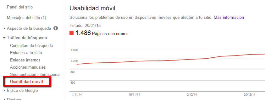
Mobile usability errors, how can I fix them?
Google Webmaster Tools indicates the list of errors detected and the number of pages in which each one of them has been detected. We can view up to 1,000 pages. 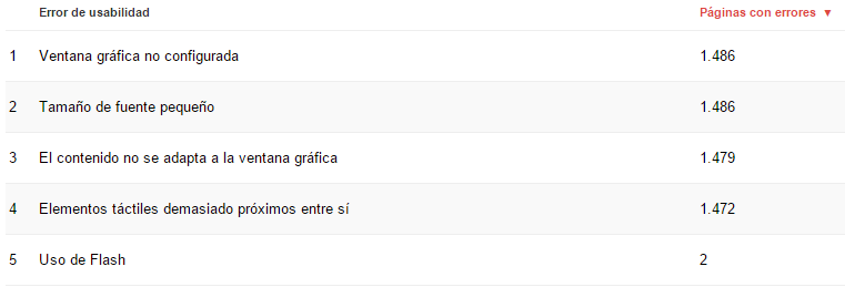
- Graphic window not configured. Pages optimized for multiple devices should include a graphic window meta element in the document header. A viewport meta tag tells the browser how to adjust the dimensions and scaling of the page. To solve this problem, the following meta must be included: <meta name=”viewport” content=”width=device-width, initial-scale=1.0″>
- Small font size. Font sizes must comply with the standards of use for mobile devices. A base font size of 16 CSS pixels is recommended.
- Touch elements too close together. Android UI guidelines recommend using elements of approximately 7 mm, or 48 CSS pixels.
- The content does not adapt to the graphic window. The need to use side scrolling to view entire pages is detected. To fix this error, pages should use relative position and width values for CSS elements and images should be scaled.
- Use of flash. Flash content cannot be viewed on mobile devices. Google recommends that the appearance of the page and animations should be implemented with modern technologies. This is a serious problem for the correct indexing of our website.
- Graphic window not configured. Pages should specify a viewport using the meta viewport tag. This tag tells browsers how to adjust the size and scale of the page to fit the device.
You can see more information by following the link with the information from Google Developers.
If you have not yet reviewed the mobile usability of your site I encourage you to do so and see how it improves the browsing experience of your users. And if you are interested in learning how to carry out an SEO campaign, the first step is indexability: your site must be indexable for search engines in order to be visible to your target audience. To do so, I encourage you to learn more about Human Level Training’s “Indexability Audit” course. 