

Written by Juan Pedro Catalá
Index
Currently, most companies do not use Responsive Design when designing their newsletters, despite the fact that more and more people check their email from their mobile or tablet, as we can see in this study conducted by Splio.

If the trend continues, it is estimated that by the end of the year, 50% of emails will be opened from a mobile device. This is largely due to the large increase in the number of mobile devices in Spain with Internet connectivity.

- A single newsletter independent of device and device resolution, saving costs.
- Improved readability and usability on mobile devices, avoiding the need to zoom in to read the newsletter correctly or to click on the button or action link in a simpler way.
- It can increase sales by up to 70% on mobile devices and double the number of buyers.
- 80% of people delete the email if it is not viewed correctly on their mobile device, by applying Responsive Design we avoid this.
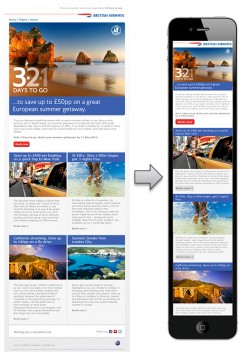
There are two things we have to take into account when creating a responsive newsletter: the screen size of mobile devices and the fact that they are tactile.
For this purpose, it is indispensable:
- Make the font size larger so that it is easily visible from a cell phone. It is recommended that the font be at least 14px.
- Enlarge the size of buttons and action links so that the user does not have problems when pressing them with the finger on a touch device.
- Scale images to fit the screen resolution of the device.
- Change the structure to a single column and linear to facilitate reading from cell phones.
- Eliminate non-essential content such as advertisements or irrelevant related content.
- Make a simple design with a concise and clear message that is seen in the first screenshot to catch the reader’s attention and provoke them to click the action button.
Meta viewport
Declare the viewport meta tag in the <head>, with the values width=device-width so that the device uses its real width and initial-scale=1 so that by default the email is loaded without zoom.
<meta name="viewport" content="width=device-width,initial-scale=1" />Media queries
Responsive emails make use of CSS media queries, which are a series of conditional rules that are based on the screen resolution of the device to apply some style rules or others. By using media queries we can adapt the design of our emails to any device.
The minimum crop sizes usually taken are 480px, 768px and 1024px. Being 480px the crop for mobile in portrait, 768px the crop for tablets in portrait and mobile in widescreen and 1024px the crop for desktop and tablets in widescreen. So we would have the following CSS rules:
// ESTILOS COMUNES

@media screen and (max-width:1024px) {
// ESTILOS DE TABLETS PANORÁMICO
}

@media screen and (max-width:768px) {
// ESTILOS DE TABLETS VERTICAL Y MÓVIL PANORÁMICO
}

@media screen and (max-width:480px) {
// ESTILOS DE MÓVIL VERTICAL
}
Flexible structure and relative units
An essential change for our newsletter to adapt to the screens of different devices is to use a structure with 100% width.
So that it does not stretch to the full width of the screen on monitors with large resolutions, we can limit the width of the email by using the max-width attribute in our table or container element, setting the number of pixels we want it to stretch to as a maximum.
Fluid images
To make the images scale and adapt to the width of their container we have to set their width to 100%.
<img src="http://www.tu-dominio.com/ruta/tu-imagen.jpg" alt=""
style="width:100%; max-width:100%;" />
By applying these techniques you will get a newsletter or email advertising that adapts to the screen of any device and a great improvement in usability and readability that your subscribers will undoubtedly appreciate.