

Written by Antoni Saurina
Index
One of the shortcomings of AdWords has always been the presentation of reports, because they could not be displayed graphically. To do this, the data had to be downloaded, for example, in Excel format, and then graphed as we saw fit.
The new report visualization tool is now available for all accounts, allowing you to display campaign data quickly and easily in graphs.
The new graphical reporting tool allows you to represent the data in a quick and easy way, obtaining an excellent visual result.
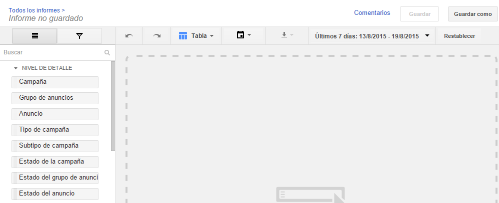
To go to the reporting tool we have to log in to an account and in the top menu we can find the link “Reports” which will direct us to the tool. To create a new report we go to the red button “+REPORT”, where a submenu will be displayed giving us the option to choose the type of report we want to create.

Let’s see an example with each of the four report types to see the possibilities offered by each one.
AdWords reports with table display
First we select the “Table” option, which, as its name indicates, will represent the data in a table. Now we can see something similar to the following screenshot.
In the page that appears you can see at the top, a menu where you can select, among other options, the date range of the report, so that it shows the data between the selected dates.
On the other hand, we have at the bottom of the previous menu, a column on the left side with the data that we can visualize, and on the right side the data that we have chosen will be shown. To select a data, we will only have to drag it from the left side to the right and drop it, then, we will be able to see how it stays fixed.
Let’s represent a report in table format where we can see the CTR of a campaign. We simply drag the “Campaign” and “CTR” data and it will show us the data.
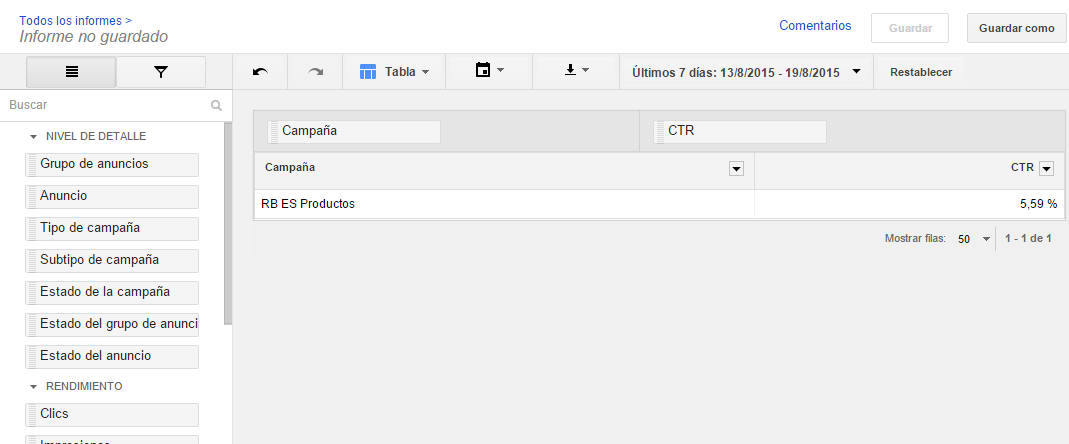
As you will see it is very practical, although in this case it is not very visual, since it only indicates the average CTR numerically between the selected dates. Even so, the table representation has some advantages over graphs, such as segmentation. Selecting on which campaigns we want the information to be displayed is not available in the graphic options.
AdWords reports with line graph display
We will now look at the same data but with a line graph. To do this, we do not have to do it all over again, we simply have to change the display type. In the top menu, where it says “Table”, we have to select “Linear Chart”.
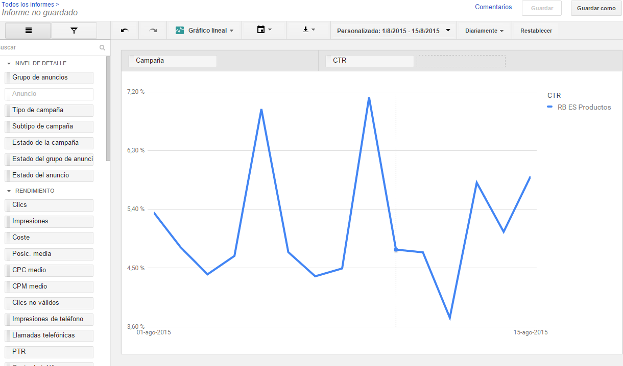
With the line graph we will see the evolution of the data by days, weeks, months, quarters or years. With this graph we can appreciate the evolution of the data over time in a very visual way being much easier, for example, to detect behavioral patterns.
The line graph gives us the evolution of the data in a very visual way and can help us to easily detect behavioral patterns.
AdWords reports with bar graph representation
Unlike line graphs, bar charts and pie charts help us to compare various data with each other.
To see how bar charts work, let’s modify it by selecting it from the top menu. In this case we will compare a very interesting data such as the CTR of the different devices in a campaign. For this we can continue to use the same example report. Remove the campaign box by dragging it out of the data area and it will disappear. Then, we drag the device box from the left column to the data area and we will have a result similar to the following image.
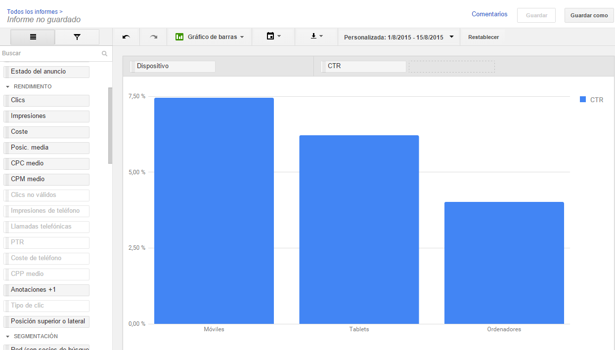
As you can see, the bar chart shows the data in a way that makes it easy to compare at a gl ance the CTR between devices, being able to see that the CTR on mobile devices is almost twice as high as on computers.
AdWords reports with pie chart representation
In the case of pie charts, we will compare how much traffic each device brings us. To do this, select the “Pie chart”, remove the “CTR” data and add the “Clicks” data.
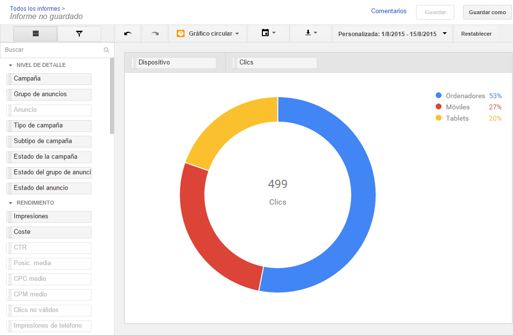
The pie chart also provides a quick visual analysis of the data showing that more than 50% of visitors use a computer.
Bar charts and pie charts help us to analyze data quickly by comparing them visually.
Once we have created the report we can save it, download it and even schedule it to be sent to our email periodically.
Reports in AdWords campaigns are essential, and besides using them to inform the client of the evolution of the campaigns, they are used to know how the campaigns are working and to be able to apply improvements and optimize. With the new reporting tool it is faster and easier to visualize the data and therefore make decisions to improve the campaigns we are managing.
What do you think of the new tool? Do you find it useful? You can leave your opinions in the comments section.